In regards to the body text, this uses the default InDesign font called Minion Pro Regular. This was done in response to one of the quotes presented in my essay by David Carson which states 'designers have gotten lazy, letting the computer make so many default decisions for them'. Therefore, in this sense, I have let the computer make the decision for me. Despite this though, it was thought the traditional serif type worked well to ensure clarity of information.

When beginning to typeset this, initial research into the principles of typesetting were again looked at. The use of columns has been done in order to break large passages of text into smaller, easier to read sections which follow the typical flow of reading. Text within these columns has been justified meaning it fills the whole of the text box, with the last line left-aligned.
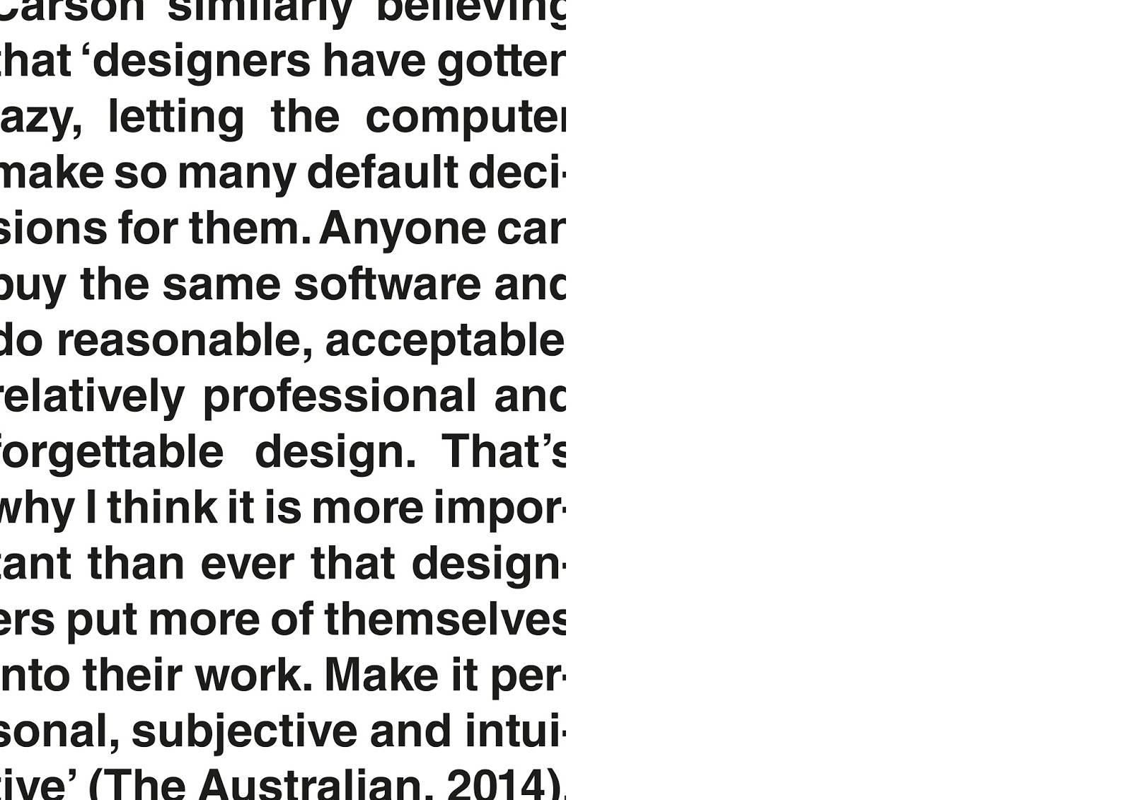
Another alternative idea into the typesetting of text was to place quotes on their own to show practising designer's views on the subject of objectivity and subjectivity presented within my essay. In the variation shown below, this was based on one of Jan Van Toorn's pieces of work which stretched type across the whole page at a large size. This continues to show direct links in putting such arguments of design into practice.


Particularly thinking about subjective means of design, some of this type was also overlayed many times in order to produce a trail of type, inspired by the overlaying of text which was found to be a common theme when researching examples of Dutch graphic design. This aesthetic was also thought to match that of designers, such as David Carson.

No comments:
Post a Comment