Wednesday, 25 April 2018

OUGD501 - Context of Practice 3 - Project Brief

BA (hons) Graphic Design

Context of practice 3: Practical brief template

Name
Megan Keighley.

Brief title
How has the resurgence of handmade methods of design production affected the culture of 21st Century digital graphic design?


Brief (outline the general aims of the project)
- Produce a body of work using handmade techniques – focus on screen-printing in particular.
- In the form of a screen-printed poster campaign, look at the advantages of traditional, handmade methods of graphic design in the digital age – look at the ‘late age of print’ and how this has affected digital culture, what makes handmade techniques so appealing?


Background / considerations
- Constantly consider and refer back to the initial research question to ensure this and the presented arguments are being communicated through the practical work.
- Look at the history of traditional print and print culture to help inform the work (‘the age of print’, 1450).
- Also consider print capitalism (1842) - the replacement of culture with popular culture, the idea of the mechanical vs. the intellectual.
- Print culture AND distribution – think about how the campaign material would potentially be distributed and reproduced on a large scale if used in the real world (advantages/ disadvantages over digital?)

Deliverables
- A significant body of research, documented through blog posts.
- Ideas generation and prototypes.
- A finished outcome communicating the intended message and research question.
- 5 – 6 design boards documenting the process.


Mandatory requirements (essential requirements that must be followed)
- Must be related and respond to the research question (how has the resurgence of handmade methods of design production affected the culture of 21st Century digital graphic design?)
- Must demonstrate you are able to make sense of and use theoretical research in the development of graphic design work (use processes such as screen-printing – those with a focus on the handmade.
- Must be embedded within some kind of graphic design practice.
- Must demonstrate design process – brief analysis – research (visual, contextual, theoretical) – ideas generation – ideas development – prototypes – further developments – outcomes.
- Develop contextual and critical awareness in the development of graphic design work/practice – demonstrate your process, criticality and creatively.


Research: references to reading (essay)
- By Hand: Handmade Elements in Graphic Design by PIE Books.
- The New Handmade Graphics: Beyond Digital Design by Anne Odling-Smee.
- Fingerprint: The Art of Using Handmade Elements in Graphic Design by Chen Design Associates.

OUGD501 - Context of Practice 3 - Research Proposal

OUGD501 - Project Statement and Evaluation

Write a project statement that explains and justifies your choices in respect to your essay, practical project and the relationship between the two. 

You should start by discussing what literature you have read and what arguments were formed through your written piece then go on to explain and justify your choices and decisions made in establishing your practical project with particular reference to your written work. 

Explain and justify how you have used your theoretical research (essays) in your practical work and how your essays have influenced your practical work.

In response to Context of Practice 2, it was decided to focus my essay on the debate between objectivity and subjectivity, one of the longest running debates in the history of graphic design. With a particular focus on type and layout design, the question which was formed states 'does design, in particular, type and layout design, have to be objective to be functional?'

In starting to research this topic, one piece of literature which I read was the famous 1972 debate between designers Wim Crouwel and Jan Van Toorn on the topic. Through this it was found that Crouwel was particularly in favour of objective design, suggesting that graphic design needs to consist of an order for the benefit of clarity and transparency of information, which needs to be founded on certain principles since such clarity and transparency on their own do not lead to quality of information. On the other hand, Van Toorn favoured the subjective approach to design, suggesting that there is no such thing as an objective message, since designers introduce an element of subjectivity in everything they do (we are subjective by human nature). As a result, subjectivity within design should be used to the designer's advantage to freely construct social meaning.

Another piece of literature read was Graphic Design Theory: Readings From The Field. Within this, the beliefs of varying designers were communicated, one in particular being Joself Muller-Brockmann who was in favour of the grid in producing objective pieces of design. One of the main arguments stated by Brockmann was that 'the grid allows endless individual variations' and suggested that the designer can still have creative freedom whilst still using objective means of design, contrasting the view of Van Toorn found in The Debate. 

Based on such arguments presented within the essay, in establishing a practical project with particular reference to this written work, it was decided to produce a publication to put such ideas of type and layout design into practice, using both objective and subjective means of design. The main way in which this theoretical research has been used within the practical work was that the essay itself was used as the written content for the publication, typesetting each section in various ways which were meant to be representative of the arguments being communicated in each passage.

Another particular way in which theoretical research has been used to influence the practical work was through looking at specific quotes using within this, singling these out and putting them into practice. For instance, one David Carson quote suggests that 'designers have gotten lazy, letting the computer make so many default decisions for them'. This can be seen within the publication in the use of type in that the default font Minion Pro has been used to present the main passages of body copy. Another quote used stated that a lot of design today all looks the same due to objective principles, therefore suggesting design lacks individual identity. This has been used to inform decisions in the overall colour scheme of the publication, using a set palette of black, red, yellow and white which was taken from a lot of found examples of Dutch graphic design. This also allowed me to provide a consistency throughout the publication which highlighted this argument even further.

Overall, however, the design of the publication aimed to communicate the conclusion of the essay in that objectivity and subjectivity work hand-in-hand in terms of design, and that design does not therefore have to be purely objective to be functional and have a purpose. In visualising this, a happy medium was found between the two approaches and utilised in the layouts.

OUGD501 - Final Developed Publication Spreads

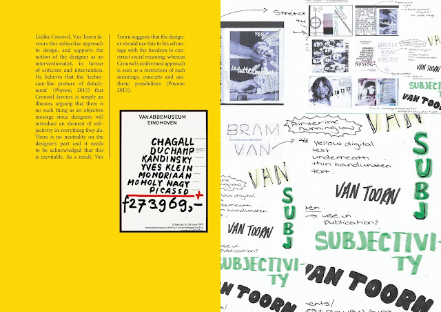
Based on feedback, it was decided to develop the publication for one last time before the printing process. It was suggested by peers that the use of handwritten text in some of the spreads did not fit with the rest of the publication and that these should redone using digital means. However, it was thought that these held appropriate links to some of the arguments within my research question and essay, as well as links to research into various postmodernist designers, like Jonathon Barnbrook. In the development of this then, it was decided to keep the use of handwritten type but manipulate the colour of the backgrounds to better match with the overall colour scheme of the publication which was based on the typical colours found in the aesthetics of Dutch graphic design. The use of this within the publication was also thought to match the front and back covers of the publication.


OUGD501 - Final Evaluation

In the feedback of the final publication, overall, it was considered that the designs work to provide direct links between the practical work and critical awareness presented in the context of practice essay. One of these things is the colour scheme present within the publication. It was thought that this works well to provide consistency in the publication, as well as representing the consistency in much design today produced as a result of objective approaches to design. This was considered to be a not-so obvious choice and so was thought to be a clever idea to provide an element of playfulness in the design of the publication.

Another strong point which was considered was the use of content - there is lots of it and plenty of images. It was thought these work well to enhance the arguments presented in the essay as written content, which shows such arguments in practice. These design decisions therefore also effectively show how critical awareness of graphic design theory has helped inform the development of the practical work.

In terms of typography as one of the main elements of the final design, the use of default fonts was initially thought to be uninformed, however actually links directly to a quote present within the essay, which after be an interesting decision. Despite decisions like these being interestingly informed, other parts such as the handwritten elements (although subjective) do not necessarily fit in with the overall aesthetic of the publication. In developing this further, these elements of type should therefore also be made digital in order to provide consistency with the rest of the design decisions.

In the final printing production of the publication, standard printer paper was used along with a saddle stitch method to use a similar process informed by the way in which most individual, personal zines are produced. However, potentially the publication could have been printed onto a glossier stock of paper to match that of typical magazines which have been used to inform more of the designs, such as Ray Gun magazine and Design Anarchy from Adbusters. In binding these papers together, a perfect bind could have also potentially been used to match the bind of most books now, however, it was considered that saddle stitch continued to work best in representing features of a magazine. One particular problem faced in the printing production, however, was that colour had not been replicated as well as it showed on-screen, therefore leaving some of the brighter colours duller and with a slight striped effect. Despite this, this effect could be seen to add an extra element of subjectivity to the publication in that the process was unintentional and unmanipulated by a person physically.

OUGD501 - Final Printed Outcome

 Examples of spreads from final printed outcome:


OUGD501 - Production Process - Printing and Binding

When considering how the final publication would be printed, research was continued to look back on to inform these designs. In the end it was decided to print onto standard printer paper, with the addition of a matte cover to add an element of structure to the final publication. This decision was based on a quote by David Carson used within my essay which states 'designers have gotten lazy, letting the computer make so many default decisions for them'. Through this then direct links are produced between my written and practical work, showing how my research has informed design decisions of graphic design in practice.

Once printed, the process of binding each page together used a saddle stitch method since this was thought to be most similar to the binding process involved in many magazines today. This was inspired by research into Ray Gun magazine and Design Anarchy magazine which have both been designed with subjectivity in mind. Through this, it was also hoped that it would give the publication some sort of commercial purpose in presenting alternative arguments on the debate between objectivity and subjectivity.


OUGD501 - Project Rationale

Based on arguments and research presented within the context of practice essay, the publication aims to communicate such arguments, and show contextual and critical awareness in the development of graphic design practice.

The publication uses content from the essay itself as the written content within this, as well as a range of primary and secondary sourced images to show examples of each argument in practice. Through the layouts of such content, this aims to, overall, communicate the conclusion which states that design does not have to be objective to be functional, but instead is already produced through slight subjective means since human beings are subjective in themselves, whilst there also needs to be underlying knowledge of the principles of graphic design first in order to break these rules. This shows how objective and subjective design can both work hand-in-hand to produce a well informed piece of graphic design. In visualising this, a medium was found between objective and subjective layouts which has been utilised through various methods of typesetting, and making and breaking the grid.

OUGD501 - Final Design Explained

The aim of the final publication was to produce a body of work which critically comapres the use of objective and subjective methods of graphic design, and how well they communicate an intended message. In this publication, the content of the written essay has been used to show how this has had a direct impact on the development of a body of practical work.

The overall layout of the publication finds a happy medium between both objective and subjective methods of design, which has been used to communicate the conclusion of the essay that design does not have to be purely objective to be functional and hold purpose.Within this layout, an underlying grid system has been both used and broken to support the argument that a basic understanding of the principles of graphic design must be had to be able to break the rules.

In a similar sense, the principles of typesetting were also used in the publication through formatting the main areas of text into columns of two to present clarity of information. This was then combined with more subjective formats, such as overlaying text to give a more playful aspect to the publication that would potentially make it more engaging for the audience to look at since it adds a more personal, handmade touch to the design, which links to ideas presented by David Carson that suggests it is more important than ever that designers put more of themselves into their work.

Inspired by the other half of this quote by Carson, the default font Minion Pro was used for the main body text, suggesting the argument that designers have gotten lazy letting the computer make so many default decisions for them. This has been combined with the use of Helvetica, representative of the contrast between subjectivity and objectivity. Other elements have been handwritten, inspired by designs from Jonathon Barnbrook. This can be seen particularly in the cover of the publication and introductory quotes to each section, whereby the image of Van Toorn on the original cover of ‘The Debate’ has been scribbled over to represent the initial research question that asks if design has to be objective to be functional, and since Van Toorn is a subjective designer, initially it may be believed his designs hold no purpose, so was therefore removed from the cover.

The colour scheme of the publication has been inspired by the colours which were typically found to be used together when researching examples of Dutch graphic design, which in particular were red, yellow and black, used mainly in overlayed text. This was done to communicate the argument that so much graphic design today all looks the same, whilst adding an element of consistency throughout the publication.

OUGD501 - Colour Scheme

In reviewing the first version of the publication, it was found that it's simplicity did not work well enough to convey the arguments presented within the essay and would therefore fail to show effectively how written theory work has helped in the development of practical work. For this reason, it was decided that the publication needed some sort of underlying colour scheme to bring life into the publication and pull all content together to work as one whole.

The colour scheme eventually chosen was based on research into Dutch graphic design, which found a prominent use of black, yellow, red and white. These colours were therefore utilised throughout the publication to provide an element of consistency which also brightened up the pages. Various elements of type were then also developed to work and be in fitting with this new colour scheme. This colour schemes was also chosen more specifically in order to communicate the argument that suggests so much graphic today all looks the same due to the use of underlying graphic design principles, rather than putting intuitive, personal elements into work.


OUGD501 - Initial Publication Spreads