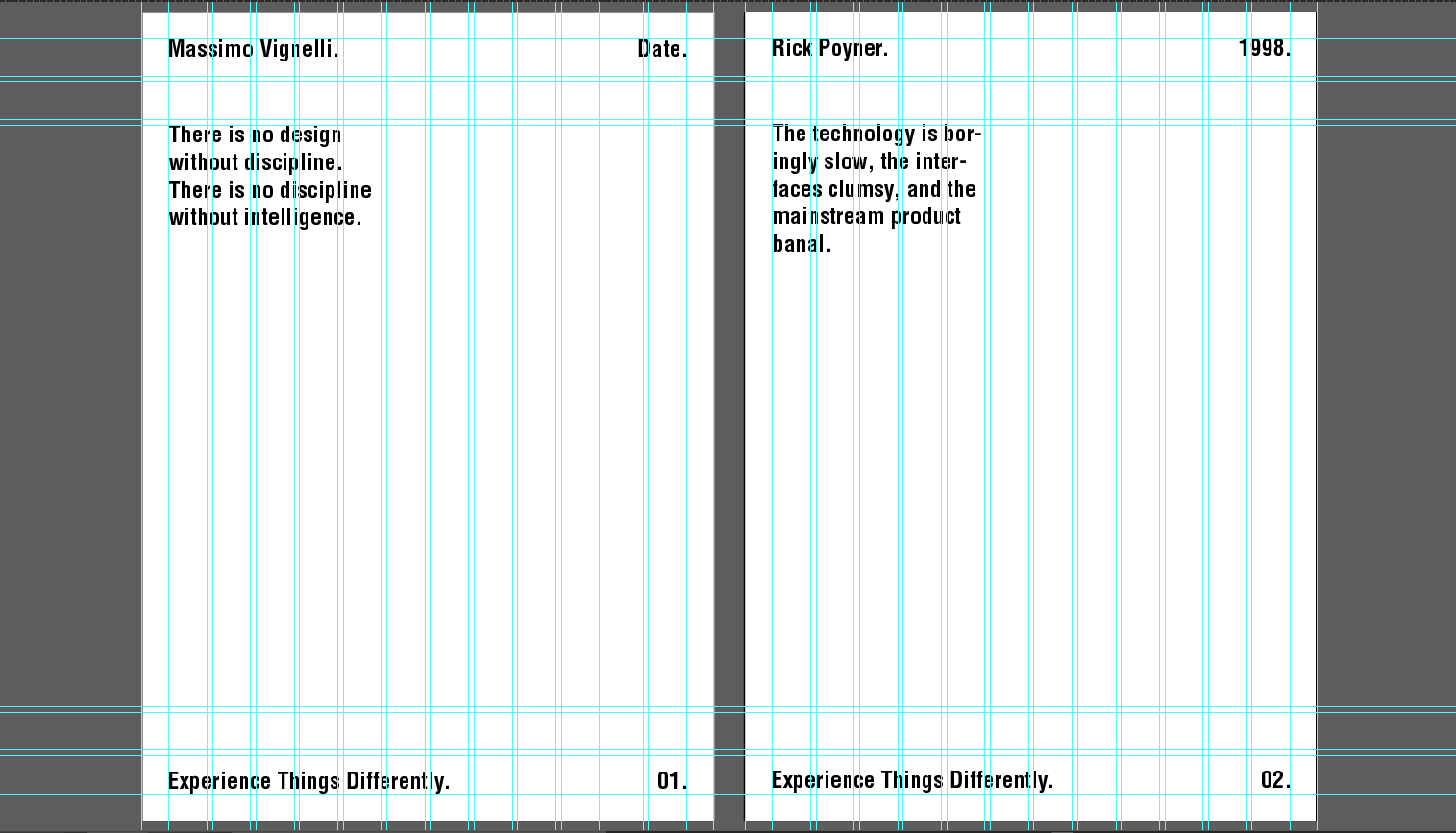
The designed column grid was used to structure all these design developments, since Vignelli believed that design must be disciplined in order to be effective. A 20 mm gap around each edge of the page has been added of which all information will be contained within. This adds an even amount of negative space around the edges of the poster which is important for visual impact and readability, according to the Bauhaus and Swiss design movements.
It has been decided that one of these designs will be screen-printed as the handmade method of production, since this shows a physical engagement between the hand of the designer and the material / process, however the designs will continue to mimic digital design styles as proposed in my brief for aesthetic contrast. One element which I have kept consistent throughout all these design developments is the use of a header and footer, which upon feedback, was suggested works well to communicate to the viewer that there is something different about the posters which they have to figure out (message) and produce a more interactive experience between the two.
The designs below focus on the idea of rationality within the Bauhaus, suggesting that when something appears larger or different from the rest, the more attention it will attract. Here, the quote has been split into sections through the use of solid colour and outlines so that the viewer only focuses on one section at a time as to easily break down the meaning of the quote. These sections could also potentially be different colours to produce the same effect.

Similarly, these designs below show a similar layout, however the words which I deemed most important have been highlighted using block colours. This attempts to add a bit more depth to the poster through the inclusion of these minimalistic block colours, which can sometimes also be seen in Bauhaus and Swiss style poster designs.


The designs below split up things even further, adding extra lines in the header and footer so that all information is contained within them, and enlarging the series number, placing this in playful ways which overlap the quote. This was inspired by existing Swiss poster designs, which seem to enjoy enlarging particular elements of type for visual impact. In addition, the kerning between these enlarged numbers were tightened to ensure that the design did not become too overcrowded and continued to leave sufficient negative space.

The next designs were focused more specifically on the Bauhaus. This design involves placing words on angles structured next to rectangular coloured blocks which weave slightly between words. Like in the designs above, the quote has been structured so that each section joins together as to not repeat words. This makes it more concise and allows more negative space.

The colours used in the design above were also inspired by the Bauhaus, however, the chosen design will be screen-printed which means printing each different colour individually, and since these posters will be A2 in size, this may be very time consuming. Therefore, this design was developed further in attempting to limit the colour palette to one or two colours without the design losing its impact.

This final design development also structures the type against the coloured blocks in a simple, but impactful way through the use of inverted colours and slight angles which highlight two of the most important words within the quote.

All of the designs above make use of varying styles of the typeface Helvetica, since this is a typeface well known for its structure and clarity, a typeface which Vignelli and other Bauhaus / Swiss designers favour in digital design, which I am aiming to replicate through the handmade.
No comments:
Post a Comment