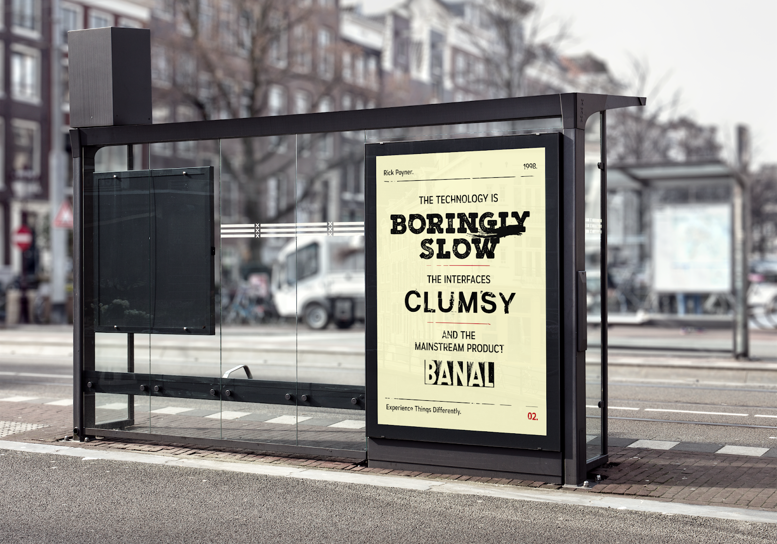
Putting these designs into context, it was thought in order to reach a wider audience, that these posters should be placed on advertisement boards at train stations and other public transport spots. The placement of these posters would then hopefully attract more attention amongst the public, since when people are waiting for their train or there has been delays, generally people look towards these advertisements as something to pass the time. Train stations also tend to be hosts to a broad range of people, from different countries, cultures, social backgrounds, etc, who are on their travels, therefore highlighting the importance of the designs as universal through their aesthetic contrast and multi-disciplinary approach.
The posters have also been designed accordingly to this context in terms of their size. The final printed versions have been produced at A2, which was found to be around the typical size of advertisement boards at train stations. This larger sizes therefore allows more people to see the posters from afar, as well as create more of an impactful and engaging experience when looking at a more close and personal level.
However, if these designs were also going to be used on bus stop advertisements, they would need to be used with one poster on each side of the board, since the posters are intended to be seen together in order to effectively communicate their message.


No comments:
Post a Comment