Monday, 17 December 2018

OUGD601 - Project Statement

In this project, it is important to show the connection between my written and practical work, how one informs the other, showing a use and understanding of theory in relation to practice. My essay started with a quote from Donald A. Norman taken from his book The Design of Everyday Things, suggesting that 'the designer needs to have a deep understanding of who he is communicating for', and 'designers are therefore reminded to consider the psychological principles of human behaviour, aspirations and motivations' (Arhipova, no date). This quote was also taken as a starting point for my practical work, since the project was based around the idea of experience and changing people's perceptions of different design production methods. Within this, the two final posters show examples of experiential features discussed within the accompanying essay, therefore linking this practical work to the psychological principles of human behaviour and interactions that Norman discusses in the quote above.

Within this introduction, initial definitions of the different design production processes were also given, defining the handmade as design which includes 'the aspect of craftsmanship; an item made by hand or by a hand process' (BigCommerce, no date), and defining digital as design produced using means of the computer and its associated software. This initially helped to show the difference between the two processes in discussion, as well as then also allowing me to clearly distinguish between the two processes within my practical work, giving a clear basis to work towards. Another definition within the introduction of my written work was that of a poster, described by Lippert (2017) as 'a temporary promotion of an idea, product, or event put up in a public space for mass consumption'. This is evident in the context of my final designs, whereby they would be placed in public transport spots, typically on train station advertisement boards, in order to be 'consumed' by a mass amount of diverse people.

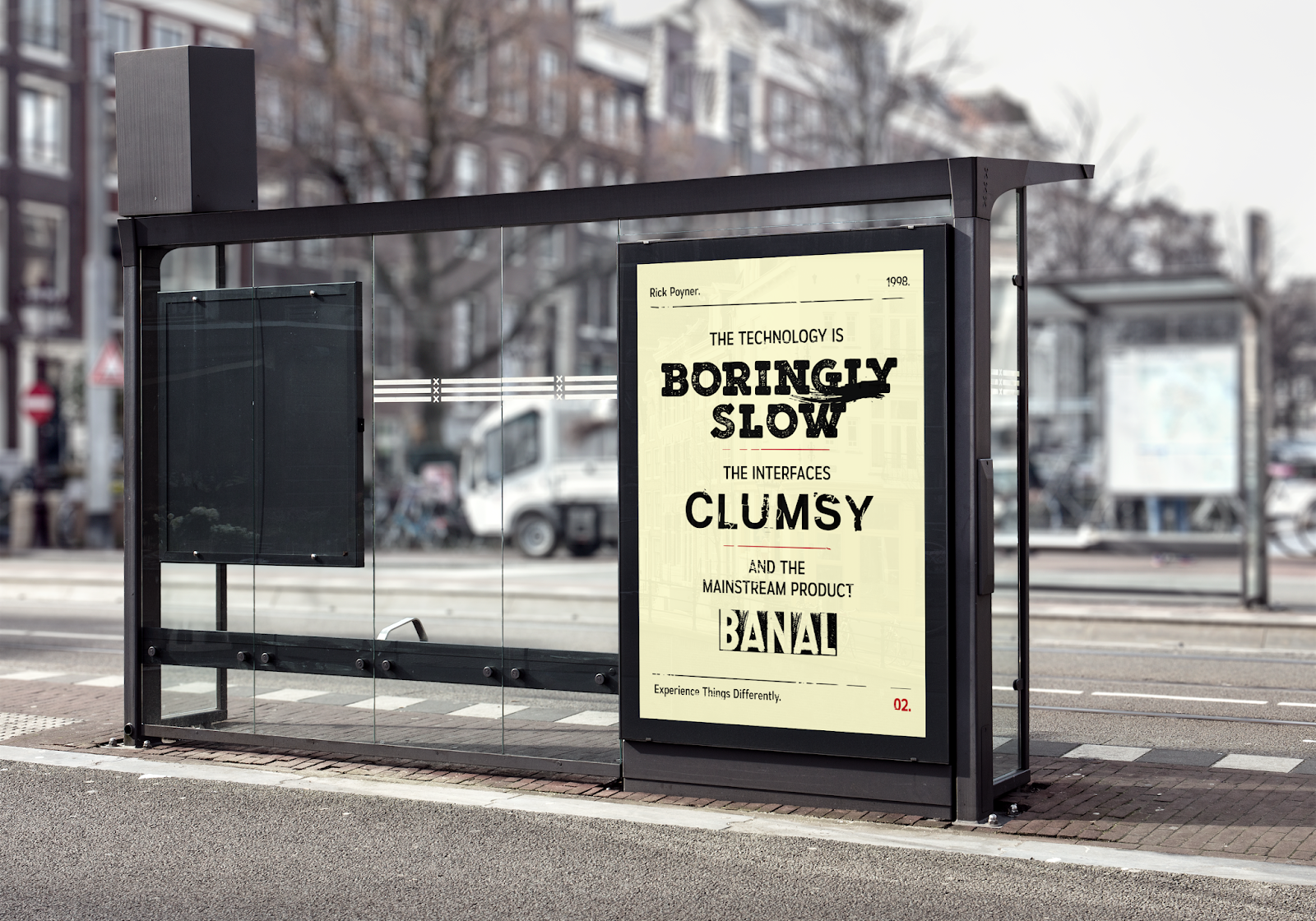
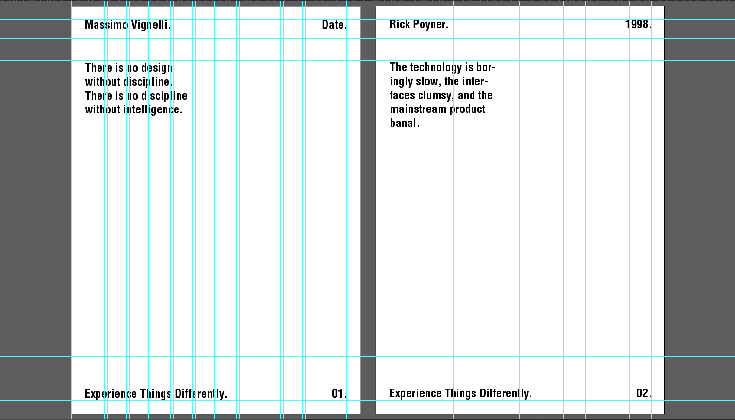
The two final posters are purely typographic, a decision based on the idea that too much other content, like images, would limit the experience of the designs aesthetics and so not as effectively communicate the message aiming to be presented. This decision was also informed by initial research into Bauhaus and Swiss design, which played on two of its key tenets of simplicity and functionality, suggesting that 'typography is one of the most fundamental elements of visual communication that is able to deliver the message in a very precise, clear way', and 'as these basic elements, like typography, have so much aesthetic potential, there's rarely a need for other visual graphics elements' (Smashing Magazine, 2009). In addition, the typographic content for these posters were quotes taken directly from the essay, showing a definitive clear link between the theory and practical.

In order to house this typographic information in an effective way, both posters use an underlying column grid system, which was specifically designed to a size of A2, and used to provide some element of consistency between the two posters. This decision came initially from research into digital design styles, which were found to typically favour structure and discipline. In terms of theory presented in the essay, these ideas linked to the principles found in Gestalt psychology, which 'explores how elements are perceived in relation to each other visually' (Cartwright, 2016), an important element for me to consider in its links to phenomenology (conscious experience) in attempting to produce compelling visuals. The use of the grid system was based on the Gestalt principle of order, 'the belief that alignment and symmetry are attractive and essential elements in design', and if ignored, the 'design can look out of place or incomplete, forcing our eyes to focus on little inconsistencies rather than the greater whole' (Hubspot, 2017). As a result, if these principles were ignored in the final practical design work, this would cause a limited experience for viewers and so cause difficulty in appreciating its aesthetics, which would have been counter-intuitive to the purpose of the posters and the message I am aiming to present.

To improve the posters, however, potentially the addition of other Gestalt principles could have been more carefully considered, such as figure-ground, similarity, proximity, closure and continuity, all of which can also have an impact on how we experience a piece of design. However, the use of order was one of the principles with more prominent links to my theory and practical work, and the other principles may have still worked their way into the final designs unintentionally in their general links to design production and aesthetics.

In the production of the poster design 'against digital', it was important in creating an engaging experience posed through an aesthetic contrast that the design featured the typical experiential elements found in handmade design styles, however these being replicated through digital processes to show that the technology does not have to be 'boringly slow', 'clumsy', or 'banal'. In my written theory work, it was explained that aesthetic experiences are based on sensory qualities, experience which the ancient Greeks referred to as 'both sensation and perception, and meant in general, perception by means of the senses' (Hanfling, 1992). These experiential qualities, such as 'the smell and feel [of handmade, printed matter] each add something different to the content' of a poster or piece of design (Pender, 2015), showing the production process as tactile. These ideas of tactility and authenticity were something which was used to inform the style of this 'against digital' poster in reflecting the styles of handmade production processes through presenting small imperfections. This was something that was argued viewers experience on a more personal level since these imperfections are close to our nature as humans, and link to the theory of intentionality as part of our phenomenological (conscious) experience, whereby the conscious mind attempts to match patterns by finding the best possible match from ones past experiences to the current one (Norman, 1988). In the design of this poster, these small imperfections can be seen through the use of manipulated, broken type, and textures which reflect the style of ink not fully transferred from the process, which have also been used to represent the words they are used against as means of expression, something which was also found to be associated with handmade styles of design. Examples of these elements were analysed through image analysis in the essay, taking some inspiration from the design of Anthony Burrill's typographic poster 'Work Hard and Be Nice To People'.

In the production of the poster design 'against handmade', the screen-printing process was used, a process which I felt effectively linked to the definition of handmade presented within the essay, in that it showed a physical engagement between the hand and the material/process. The process also allowed me to present qualities of digital design styles, such as discipline and gestalt psychology principles, already explained in an attempt to mimic digital design styles through a handmade process to show that this process can also be disciplined if it wants to be, and to continue to pose an aesthetic contrast between production, content, and style. In this design, inspiration was also taken from the styles of Bauhaus and Swiss design, which typically favoured a digital and disciplined approach. This can be shown in the use of strong lines of colour that highlight the use of an underlying grid system, as well as through the structure of the typographic content that plays on the Bauhaus principle of rationality, allowing the most important words to attract the initial attention of a viewer.

A multi-disciplinary approach can be seen as taken in the final poster designs through the use of the aesthetic contrast. This approach was taken in order to avoid the problems associated with using one exclusive method of design production described within the essay, problems which could have potentially limited the experience, interactions and engagement of the public with the final designs. This was also inspired by research used within the essay which showed that 'there's more of everything now, more analogue, more digital, and more cross-discipline work' (Burrill, 2018), with design practitioners 'forging new ways to integrate manual and digital methods, using them at different stages of the design process, with one informing the other' (Creative Bloq, 2013), again, in response to the problems associated with the potentially limiting experience of using one exclusive design production method. This multi-disciplinary approach was argued in the essay to aim for universality as part of generating a favourable perception amongst viewers/the public, something which was found that the theory of phenomenology also aims for in its definition of experience, since it makes an appeal to intersubjective validity, understood as 'the sharing of experiential content among a plurality of subjects' (Zlatev et al, 2008). The aesthetic contrast presented in this multi-disciplinary approach aimed to, overall, present a universal experience and equal appreciation of the posters' aesthetics amongst the public, attempting to use the experience to change their perceptions of different design production methods. The final designs aim for the viewer to uncover the message through their experience and interactions with the posters, presenting the theory of intersubjective validity in terms of phenomenological (conscious) experience through a universal 'truth'/message that can be understood by a wide range of people, no matter their individual beliefs, culture or social history.

However, the way in which the final posters have been produced could still potentially pose the same problems associated with using one exclusive production method or aesthetic if these are not engaged with enough. Despite this, though, the difference between the posters should be made initially clear through the use of typographic content which is clearly against the style that the poster poses. But, to improve, the posters could have been experimented more with the use of its multi-disciplinary approach, using both production methods in the development of each poster, rather than simply mimicking one method through the use of the other. However, I feel as though this would not have approached the purpose of the project in an as effective or clear way, and so I stick by what has already been done in my final approach.

To reinstate the conclusion of my essay then, 'digital is not better than analogue [handmade], but different. What we are asking for is co-existence, for the ascendency of one not to have to mean the extinguishing of the other' (Dean, 2018), hence why in design today, 'the limitations imposed through restricting themselves to just one tool are finally driving many people to start mixing other techniques and processes into their work' (Odling-Smee, 2002). In this way, I feel as though there are definitive clear links between my written theory work and practical work, with the approach specifically presenting a message based on this 'co-existence' between production processes that provides a universal engaging experience amongst viewers/the public, and so subsequently, an equal appreciation of the poster designs' aesthetics.


Bibliography

Arhipova, A. (no date) Psychology In Design: Principles Helping To Understand Users. Available at: https://tubikstudio.com/psychology-in-design-principles-helping-to-understand-users/ (Accessed 13 September 2018).

BigCommerce (no date) How To Define Handmade Items. Available at: https://www.bigcommerce.co.uk/ecommerce-answers/how-define-handmade-items/ (Accessed 18 November 2018).

Burrill, A. (2018) Email to Megan Keighley, 1 May.

Cartwright, B. (2016) The Science Behind Design: 8 Psychology Principles To Apply To Your Next Project. Available at: https://blog.hubspot.com/marketing/psychological-design-principles (Accessed 13 September 2018).

Creative Bloq (2013) The Future of Handmade Design. Available at: https://www.creativebloq.com/future-handmade-design-5132895 (Accessed 13 September 2018).

Dean, T. (2018) In: Media Networks (2018). [Exhibition]. The Tate Modern, London. 1 January-31 December 2018.

Hanfling, O. (1992) Philosophical Aesthetics: An Introduction. Oxford: Blackwell.

HubSpot (2017) ‘Gestalt Psychology And Why It’s Essential For Good Design’, YouTube, 7 September. Available at: https://www.youtube.com/watch?v=dk7cXdjX2Ys (Accessed 13 September 2018).

Lippert, A. (2017) What is a Poster? Available at: https://posterhouse.org/what-is-a-poster (Accessed 31 October 2018).

Norman, D. (1988) The Design of Everyday Things. Cambridge, Massachusetts: The MIT Press.

Odling-Smee, A. (2002) The New Handmade Graphics: Beyond Digital Design. Hove, Sussex: Rotovision.

Pender, D. (2015) In: Smith, M. and Cooke, A. (2015) People of Print: Innovative, Independent Design And Illustration. London: Thames and Hudson.

Smashing Magazine (2009) Lessons From Swiss Style Graphic Design. Available at: https://www.smashingmagazine.com/2009/07/lessons-from-swiss-style-graphic-design/ (Accessed 20 November 2018).


Zlatev et al (2008) ‘Intersubjectivity: What Makes Us Human?’, The Shared Mind: Perspectives In Intersubjectivity, pp. 1-14, Available at: https://www.researchgate.net/publication/232504233_Intersubjectivity_What_makes_us_human (Accessed 8 December 2018).

OUGD601 - Ethical Considerations

Ethics in practical work:

In any practical work undertaken, it is important to consider the ethics behind it. In terms of my own practical work, the posters are all about creating an engaging and impactful experience for the viewers which aims to potentially change their perception about different design production methods. These posters are to be situated in public transport spaces, particularly on train station advertisement boards, where they can reach a wide range of people. For this reason, it was important in the production of these posters that their content did not use any unethical or upsetting images or content, which people may take offence to. The use of purely typographic content in these posters, however, I feel avoids this problem, although the nature of the quotes in that they are against different design production techniques may frustrate some individuals if they are advocates for that particular method. However, the way the designs have been produced means that this should also not be a problem in terms of ethics if the individuals are to engage fully with the posters, since then they will realise the meaning behind the designs in that they show an aesthetic contrast, using a multi-disciplinary approach to design, which aims to communicate that both production methods should be experienced and appreciated equally as they both bring new things into the realm of design. In addition, the idea of changing people's perceptions through the posters could also pose a problem, however the designs are not forceful in this way, allowing people to think about the meaning of the posters, and then making their own decisions based on this. Therefore, this does not show a breach of ethics.

In terms of the physical production of these posters, ethics in terms of sustainability could also be considered. Both printing processes use chemicals and inks, which if used in large proportions, can cause problems in terms of environmental sustainability. The use of a minimalistic colour scheme which mainly consists of black ink can contribute to this problem. However, for the purpose of this practical project, sustainability was not an issue that needed to be focused on, but for future projects this should be more carefully considered in terms of producing ethical design.

Ethics in written work:

It is also important to consider any problems associated with ethics in written work, for instance if the use of raw data gained from human participants has been used. In my essay I quote one sentence gained from a personal email interview with Anthony Burrill. This may be considered to pose a problem in terms of ethical consent, however before the interview took place I sent an initial email explaining the purpose of the email and that the information gained would be used for a university project (a PPP project which took place before Context of Practice 3) which was then followed by a reply from Burrill with the go-ahead showing his consent. Within the essay this quote has also been appropriately referenced, likewise with other reference sources, showing that I do not claim any of those words as my own. Therefore, no breach of ethics has been shown within this written work.

OUGD601 - Practical - Final Evaluation

In evaluating the final two poster designs, a number of things can be considered. One of these is the choice of paper stock used in the printing processes. It was thought that, in terms of the screen-printing process, more experimentation could have been done on printing onto a more glossy paper stock which may have better reflected the types of paper stock you can print on which may have enhanced the design further in looking digital. However, this would have proved a problem since glossy paper stocks are more prone to ink smudging, which would have created more imperfections in the design and so would not have achieved the intended style.

Despite this, it was thought that the chosen matte paper stock works well in producing an ultimate colour consistency between the two posters, showing them as part of a series and communicating to the public that they should be looked at together. This paper stock may also reflect the types of matte stock you can also get for digital printing. This stock choice, however, worked particularly well in enhancing the colour and impact of the 'against technology' poster design, something which matte stocks are good at, whilst this also added a slight bit of texture to the design, which added an extra element of tactility, representative of handmade design styles.

The colour consistency produced through the use of this paper stock, as well as colour schemes amongst the two posters, was thought to work well in reflecting both production processes equally, since the chosen colour schemes were found in both digital design styles, like the Bauhaus and Swiss design, as well as primary colour schemes found in minimalistic traditional print design.

Another consideration was that the screen-printed design, which was meant to look as of produced digitally, presents a couple of minor imperfections. However, these are so small they are barely noticeable, whilst this is almost inevitable in the screen-printing process. These small imperfections could also be seen as reflective of the occasional mistake or imperfection found in digital printing through problems associated with machine technology, such as low ink. Despite this, the idea of the posters is that the more the public engage with them, they should eventually realise that there is something odd about the designs and so realise that they produce a contrast between styles and production methods.

Overall, however, it was considered that the two final posters achieve their aim in effectively producing an engaging experience through the presented aesthetic contrast between styles and production methods, which works to get people to think differently about their approaches and interactions with design, ultimately ending in an equal (and universal) appreciation of the poster's aesthetics.

Friday, 14 December 2018

OUGD601 - Practical - Designs in Context

Putting these designs into context, it was thought in order to reach a wider audience, that these posters should be placed on advertisement boards at train stations and other public transport spots. The placement of these posters would then hopefully attract more attention amongst the public, since when people are waiting for their train or there has been delays, generally people look towards these advertisements as something to pass the time. Train stations also tend to be hosts to a broad range of people, from different countries, cultures, social backgrounds, etc, who are on their travels, therefore highlighting the importance of the designs as universal through their aesthetic contrast and multi-disciplinary approach.

The posters have also been designed accordingly to this context in terms of their size. The final printed versions have been produced at A2, which was found to be around the typical size of advertisement boards at train stations. This larger sizes therefore allows more people to see the posters from afar, as well as create more of an impactful and engaging experience when looking at a more close and personal level.


However, if these designs were also going to be used on bus stop advertisements, they would need to be used with one poster on each side of the board, since the posters are intended to be seen together in order to effectively communicate their message.


OUGD601 - Practical - Final Printed Designs


'Against handmade' design:

In producing design which looked digital through handmade means, the screen-printing process was used in the production of this first poster. In order to help with the alignment of the two colours, a proof print was initially pulled through the screen onto a sheet of transparent plastic, allowing a form of discipline into the process, something considered as relating more to digital styles.

The design itself took inspiration from Bauhaus and Swiss design aesthetics, movements which typically favoured digital design styles, associated with structure, discipline, simplicity, rationality and functionality. The use of strong lines of block colour came from these styles, which also helped to structure the print itself and highlight the use of an underlying grid system. The use of colour was also inspired by the Bauhaus aesthetic, using this to play on their ideas of rationality to highlight words I deemed of importance which aimed to draw viewers' attentions towards the message of the design. This use of colour to highlight certain words was also done in an attempt to not let the words get lost amongst the rest of the design due to the minimalistic colour schemes. In addition, the use of strong lines in the design helped in the production process to limit imperfections and so help make the design look as if produced digitally, as intended.

The structure and placement of the words was specific and considered as to not repeat words, which helped to link the full quote together in a more concise way. The way in which the blocks and words have been structured together also further highlights the use of a grid and discipline in the design, as well as allowing for more negative space to be present amongst the design, an element which digital design typically favours for visual impact.

'Against digital' design:

In producing design which looked handmade through digital means, existing typefaces were manipulated through the use of computer programs to better represent certain handmade styles and processes. For instance, to reflect the traditional font styles found in letterpress printing, one typeface was manipulated to include serifs, something which modern typefaces generally don't feature. The typeface, Helvetica, was also broken down into sections and 'stitched' back together in order to reflect the aesthetics of old, crumbled letraset type. Another typeface mimics the style of inverted lead blocks also used in the letterpress processes, which allows the type to be stamped onto the material. The styles of these fonts were not only manipulated to represent these various handmade processes, however were also thought about carefully in representing the words of the quote themselves, for instance, through showing the 'clumsy' nature of letraset. This use of multiple type styles was inspired by research into print styles, which seem to be more expressive in a similar way.

Extra elements of texture and misprinted type were also added to the design in order to present small imperfections and tactility into the design, which many handmade processes and styles show, such as the addition of a paint smudge onto one of the typefaces, reflecting a problem associated with screen-printing whereby sometimes the ink can smudge on the back of the screen which then transfers onto the material.

In this design, the quote was also separated into sections, something which aimed to make the viewer focus on one part of the quote at a time to fully engage with the message of the poster. The design of these separations were inspired by the tools used in traditional design processes, such as lead blocks used for kerning and tracking in letterpress. However, these have been put into a consistent style that matches the imperfect nature of the handmade as well as the header and footer elements of the design.

Consistent elements:

Both posters use an underlying column grid, produced to a size of A2, since it was found this type of grid worked better in effectively presenting typographic information, which was used to ensure a element of consistency in the structure of both posters that ties them together. Likewise, a consistent colour palette has been used between the two designs, a scheme found to be present in both digital (elements of the Bauhaus and Swiss design) and handmade (minimalistic, primary colours) production.

Another consistent element found between the two posters is the use of a header and footer, containing the tagline 'experience things differently' which viewers can then look at and realise there is something different in the way the designs have been produced that they need to figure out before the message/aim of the posters can be revealed to them. This also adds some structure to both designs where all important information is properly contained in the centre of the poster, this centre placement being something which Massimo Vignelli stated as the most important, since this is where information is most likely to gain attention.

In the way these posters have been produced, both take on a multi-disciplinary approach, something which was found to be more prominent in the design industry now that designers use to avoid problems associated with the experience of using one exclusive method of production. The aesthetic contrast produced in these designs, aims to get people to 'experience things differently' and produce a universal appreciation of the design's aesthetics.

Wednesday, 12 December 2018

OUGD601 - Practical - Design Production

Handmade design production:

In order to produce a design which looked digital, I decided to use the screen-printing process, which, if done effectively, can look particularly neat in limiting imperfections. This process involved exposing my initial design onto a screen coated in emulsion, which was then washed out and ink pulled through the exposed areas, a process which clearly shows a physical engagement between the hand and the material, supporting the definition used in my accompanying essay.

In order to help with alignment of the design where two colours have been used, a proof print was initially pulled through the screen onto some material which then acted as a guide for the rest of my prints and helped the design seem more disciplined. However, since the process is mainly about time and skill, some prints produced more imperfections than I anticipated, however, this is something which is almost inevitable due to the nature of this process.


Despite this, the use of strong lines and limited colours particularly worked in my favour to help structure and align the print, which meant that a few came out well enough with virtually no imperfections that they could potentially be passed off as digital prints.


Digital design production:

In producing type which reflected handmade styles, I started with existing typefaces then manipulated these in order to produce type which better represented the styles and processes. For instance, in the case below, serifs were added to the typeface, as well as an adjustment of kerning and tracking between letterforms to accompany these new elements sufficiently. It was thought the addition of these serifs reflected more traditional type found in letterpress since many popular modern, san-serif fonts were not yet developed. The grainy effect also brought in small imperfections into the design of the type which reflected the processes of screen-printing and letterpress whereby sometimes the ink does not fully transfer.


Another example of how I manipulated type shows an initial use of Helvetica, which was then broken up into sections and bits cut out in order to reflect the aesthetics of crumbled letraset type. Through this process of manipulation, this also allowed me to use the styles to reflect the words themselves, for instance how here, 'clumsy' has been paired with broken elements.


This broken aesthetic can also be seen through other elements of the final poster design, whereby small elements of the design have also been broken to produce a similar effect to ensure that the design does not look 'too perfect' as digitally produced work typically does.

Paper stock:

In terms of the print production of these designs, both posters used the same paper stock to both traditionally and digitally print in order to produce colour consistency between the two designs, showing them as a series. A matte stock was used since in the screen-printing process this allows the ink to stick better to the paper and avoid smudges or imperfections, which helped with the intended style of this design to look as if digitally produced. This stock also worked well in digitally printing the second design which was meant to look as if hand-produced. Matte stocks are known for being good at enhancing colour, which created more impact and added a slight bit of texture to this design, reflective of the tactility of handmade design styles.


The poster above was also experimented with printing on glossy paper, however it was soon realised that this did not appropriately reflect the message I am attempting to get across through the use of an aesthetic contrast, since glossy stocks are more reflective of digital printing.

OUGD601 - Practical - Finalised Chosen Design (2)

It was decided to choose the design below as the final one to be printed. It was thought that compared to other design developments, this one worked more effectively in reflecting the styles of handmade processes, which precisely conveys my initial reason behind the designs, that digital design does not have to be boringly slow, clumsy, banal, or limiting in it's experience.

The small imperfections adds an interesting and subtle element which makes the poster design clearly seem handmade, elements which the viewer will have to study the poster more carefully to be able to see, and therefore hopefully relate to on a more personal level, as these imperfections are similar to our nature as humans. However, in this sense, the aesthetic contrast makes them realise that not one process is better than the other, but both produce different experiences in themselves, whilst the multi-disciplinary approach I have used allows the viewer to appreciate the design's aesthetics, producing an experience which accompanies elements of experience from both handmade and digital production methods but avoiding the associated problems.

OUGD601 - Practical - Further Design Developments (2)

Based on feedback of initial design developments, it was decided to focus on further developing the final set of designs since it was thought these represented the different processes the best, and the use of small imperfections like the paint smudge and broken type made the design more impactful, particularly in attempting to produce the aesthetic contrast and meaningful experience in viewers I am aiming for. In the design below, the paint smudge has been made smaller, since it was considered that the larger size looked slightly unrealistic and distracted the design too much.


For similar reasons to some initial design developments, it was also considered that the header and footer elements were too perfect in their style. Therefore, it was decided in these further developments to add small and subtle strokes across these elements of type in order to mimic the effect of ink not fully transferring onto the paper so that the type is disrupted slightly.


OUGD601 - Practical - Feedback and Considerations (12/12)

In the first set of developments, it was considered that the main type styles worked effectively to reflect various handmade production techniques through the use of texture, however it was considered that the design may be too simple and lacks some substance. It was thought that breaking up the quote into sections worked more impactfully in the design so that the viewer can focus more intently on each section one at a time in order to fully understand its message, however this was thought to work better on a smaller scale than larger.


In the next set of developments, it was thought that putting the line breaks into the same style as the header and footer lines worked better to produce a small amount of consistency throughout the design, as well as better reflecting handmade processes, where ink may not be fully transferred onto the material. In addition, it was considered this should be utilised throughout even more of the design, since some elements of type looked almost too perfect to effectively represent the processes and the idea that humans may experience and appreciate a piece of handmade design on a more personal level because they can relate to these imperfections.

The third design in this set was thought of as more expressive than the rest, representing the typical expressive nature of handmade design, however, if using this design, the type should be placed into a clear shape, like a square, with the gaps filled in with elements of block colour or other type from using the full length quote.

The final set of developments looked at adding in additional elements, such as paint streaks, which were thought to be an interesting touch, however, the streak should be made smaller since at the moment it potentially looks unrealistic and its larger size means it takes away some impact from the overall design and type. The black colour should be used rather than the red, since the red was considered to look slightly threatening in its design.


Other comments:

- The use of the same grid system as the first poster works well to produce an underlying element of consistency between the two.
- Colour schemes found in print.

OUGD601 - Practical - Design Developments (2)

For these set of design developments, the aim was to mimic handmade styles through the use of a digital production process, whilst the quote is against the use of digital computer technology, in order to show that this does not have to be a limiting experience as the quote expresses, it can also be expressive and not all digital design has to look the same.

The layout uses the same grid system, and header and footer as the other poster in order to produce a small element of consistency between the two, making it clear they are both to be looked at together as part of a two-part series.

In the main use of typography, this has been inspired by different handmade production processes and the styles of type they can produce. In order to do so, existing typefaces have been manipulated to represent the processes of screen-printing, letterpress and letraset, using these to represent each word in its meaning. For instance, the word 'clumsy' has been manipulated to mimic the style of crumbled letraset, a process which could perhaps be considered clumsy if not done perfectly. The use of these different type styles all on one poster was also inspired by many letterpressed posters which are made expressive through the use of different typefaces.


The next set of design developments use similar styles, however these play on the idea of splitting up the different sections of the quote in an attempt to make viewers focus more intently on each section one at a time, to make their aesthetic experience more meaningful. The use of these lines were also inspired by leading and kerning in the letterpress process, whereby blocks of lead have to be placed above and below the type to help set it perfectly in a line.


However, the line separations in the designs above were thought to be too perfect in effectively mimicking handmade styles, which tend to feature small imperfections occasionally when printing. For this reason, the next set of developments below use broken and uneven lines to separate the sections instead, which reflects the process better. Adding subtle elements of colour into these designs were also experimented with in order to give it a bit more substance.

In order to continue to reflect the imperfections and potential mistakes of handmade production processes, the designs below experiment with adding in paint strokes as if the paint in the screen-printing process has smudged on the back of the screen or mistakes made in over-exposing the screen.


Another variation, very different from all the other developments was also produced. This development places type close together, filling in gaps where words end with other parts of the quote. This layout was inspired by the expressive nature of some letterpressed typographic posters, whereby type in set into a specific shape using different styles to make it clear where sections are.


Each of these design developments use colours similar to that of the other poster in the series in order to produce another subtle element of consistency between the two, whilst this version is not as impactful as the other since it does not have as much of a focus on rationality than the Bauhaus. These colours can also be linked to the screen-printing process, whereby generally simple and limited colour palettes are used in order to make the process easier and quicker, or perhaps more effective in the use of only one colour.

Monday, 3 December 2018

OUGD601 - Practical - Finalised Chosen Design (1)

It was decided to choose the design below as the final one to be screen-printed. It was thought that compared to the other design developments, that this one allowed for a clearer presentation of the message at hand in the way that the words of most importance have been highlighted in a different colour to the rest of the design, which aims to draw the attention of the viewer to this message (since the message of the posters is considered to be the most important element in producing an experience within the viewer).

Feedback on this also suggested that this worked better compared to the others in the way that the use of colour presents the design as still being influenced by Swiss design, but does so in a less obvious way which continues to keep focus on the message without disregarding the reasons, ideas and research behind this final design.

OUGD601 - Practical - Further Design Developments (1)

Based on feedback of initial design developments, it was decided to rule out of set of designs for seeming too unstructured and 'messy' in its layout, and further develop the rest based on the suggestions and considerations of peers. The design below makes use of the favoured lighter background, but experiments with the continuation of highlighting words in the blue colour initially used in other designs. The contrast between the colours creates an impact in itself, however the use of black type on blue could still be considered as a loss of impact on these specific words, which are deemed to be most important.


In response, the next two designs change the words in the colour blocks to the same colour as the background which adds an element of separation from the rest of the quote which helps them stand as out words of importance. However, the 'newspaper aesthetic' feel is still present through these designs, which doesn't effectively present the research behind the ideas / designs.


The next set of designs have been developed from what were considered the favourites amongst peers. In these, the coloured lines have been cut to fit the border around the grid system I have used. After this development, initially I thought the blocks looked slightly out-of-place and as if they are 'floating' in mid-air, however a further piece of peer feedback suggested that this works better than the original in containing all information in a seemingly more structured way.

I have also experimented, in these designs, giving a few elements some added colour, whereas before everything was black. This was suggested would work better, not only in the design itself, but it also allows me to fully explore the production process which my essay question and this related body of practical work are essentially based around, linking the three elements of production, aesthetics and experience.


The design below was considered in initial feedback as the favourite. Similarly to the designs above, this has been further developed to include everything within the grid's border. It was also suggested in feedback that these coloured lines may be hard to replicate and align perfecting through screen-printing, particularly in the design below, since different colours have been used alternatively. In this sense, the similar designs above may be easier to replicate since the blocks are all one colour. In addition, the designs above could be seen as working better to focus the attention of the viewer on the message of the quote through this use of colour, whereas in the alternate design below, the type can be seen as a bit 'lost' amongst the black colour blocks.

OUGD601 - Practical - Peer-led Crit (03/12)

In the first set of digital developments, it was suggested that the designs produced some impact in words being highlighted, however this looks similar to a newspaper aesthetic, which isn't perhaps the right direction to aim for in terms of visual style.

Despite this, it was also thought that the black type on a blue background means that some impact is lost where the text isn't highlighted - should experiment with highlighting words in blue on the lighter background to produce the same effect but with more impact and readability. But in general, the lighter coloured background was favoured for all digital developments.


In the second set of digital developments, the way in which the type has been structured with each section of the quote linking to the most important word, repeated in both sections, was an interesting and playful way to present the information, however it could also seem too 'all-over-the-place' and unstructured in some ways.

The header and footer were still considered a nice touch, and this should be kept to one line, not two, since more than one could be a bit of an overkill. Likewise where the type had been enlarged and overlayed across other type, although the reasoning behind this idea makes sense, this could also be seen as 'overkill' and does not seem as structured as it could be or leave enough negative space for the kind of impact I am looking for.


The final set of design developments were deemed the favourites, particularly the top middle design, suggested that the two colours work best since this creates an extra element of impact without it being too much and too challenging to screen-print in its production process. However, something to consider when printing is that the lines may be difficult to print perfectly (since these designs are meant to look as if produced digitally), so this may take a few attempts to get right.

At the moment the coloured lines are extending off the page which look slightly odd in the way that header and footer lines have been placed. It was said, therefore, that these should be cut off at the border in order to contain everything better, and this should be kept to a similar format when designing the second poster, as a small element of consistency.


Other general things to consider:

- Think about colours for the 'against digital' poster - should these be the same colours? - however, the designs above are Bauhaus / Swiss inspired and would not be relevant to the other poster, the whole premise of these posters is to produce aesthetic contrast and mimic different production processes within design, which both clearly have different definitive styles.
- Think about both posters in relation to movements?
- Colours and consistencies within both.

OUGD601 - Time Management Plan (03/12)

Updated time plan for the last two weeks before the deadline to help manage my time more effectively and reach other smaller deadlines within this time, such as finalising practical designs ready for print.

Sunday, 2 December 2018

OUGD601 - Practical - Design Developments (1)

AGAINST HANDMADE design developments:

The designed column grid was used to structure all these design developments, since Vignelli believed that design must be disciplined in order to be effective. A 20 mm gap around each edge of the page has been added of which all information will be contained within. This adds an even amount of negative space around the edges of the poster which is important for visual impact and readability, according to the Bauhaus and Swiss design movements.


It has been decided that one of these designs will be screen-printed as the handmade method of production, since this shows a physical engagement between the hand of the designer and the material / process, however the designs will continue to mimic digital design styles as proposed in my brief for aesthetic contrast. One element which I have kept consistent throughout all these design developments is the use of a header and footer, which upon feedback, was suggested works well to communicate to the viewer that there is something different about the posters which they have to figure out (message) and produce a more interactive experience between the two.

The designs below focus on the idea of rationality within the Bauhaus, suggesting that when something appears larger or different from the rest, the more attention it will attract. Here, the quote has been split into sections through the use of solid colour and outlines so that the viewer only focuses on one section at a time as to easily break down the meaning of the quote. These sections could also potentially be different colours to produce the same effect.


Similarly, these designs below show a similar layout, however the words which I deemed most important have been highlighted using block colours. This attempts to add a bit more depth to the poster through the inclusion of these minimalistic block colours, which can sometimes also be seen in Bauhaus and Swiss style poster designs.


The next set of designs continue to focus on ideas of structure and rationality, however in a slightly different way. The most important word has been enlarged and split into two parts to act almost as a centre piece for the poster. The two sections of the quote then both attach to this word 'DISCIPLINE' in a playful way which means words are not being repeated. This also shows the links between the two parts of the quote in that discipline and intelligence are related. Another version has also been produced experimenting with colour to highlight these words further.


It was thought, based on the designs above, however, that the 'THERE IS' sections of the quote could be cut out, again to avoid repeating words as well as shortening the length of the quote to make it seem more concise and structured. This idea also came from the belief that design should cut out all unnecessary elements, and only then will it be 'perfect'.


The designs below split up things even further, adding extra lines in the header and footer so that all information is contained within them, and enlarging the series number, placing this in playful ways which overlap the quote. This was inspired by existing Swiss poster designs, which seem to enjoy enlarging particular elements of type for visual impact. In addition, the kerning between these enlarged numbers were tightened to ensure that the design did not become too overcrowded and continued to leave sufficient negative space.


The next designs were focused more specifically on the Bauhaus. This design involves placing words on angles structured next to rectangular coloured blocks which weave slightly between words. Like in the designs above, the quote has been structured so that each section joins together as to not repeat words. This makes it more concise and allows more negative space.


The colours used in the design above were also inspired by the Bauhaus, however, the chosen design will be screen-printed which means printing each different colour individually, and since these posters will be A2 in size, this may be very time consuming. Therefore, this design was developed further in attempting to limit the colour palette to one or two colours without the design losing its impact.


This final design development also structures the type against the coloured blocks in a simple, but impactful way through the use of inverted colours and slight angles which highlight two of the most important words within the quote.


All of the designs above make use of varying styles of the typeface Helvetica, since this is a typeface well known for its structure and clarity, a typeface which Vignelli and other Bauhaus / Swiss designers favour in digital design, which I am aiming to replicate through the handmade.