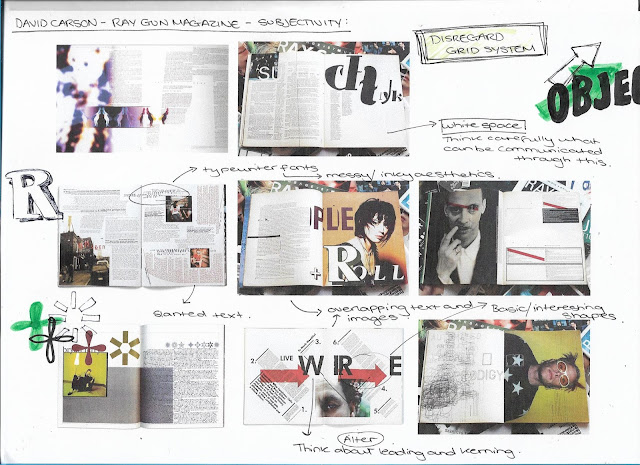
Based on this research, further ideas were brainstormed and quickly sketched out as done before, which looked at ways in which information could be communicated in an alternative subjective method. Ideas include, using lots of white and negative space (think carefully about what could be communicated through this), typewriter fonts (use messy, inky aesthetics), again think about how text and image could be combined and used together (overlap text and images, stretch over multiple pages by altering the size/ leading/ kerning of type, use basic/ unconventional shapes with block colour). This brainstorming sheet was again something of interest in itself due to the subjective nature of it.
Thursday, 1 February 2018
OUGD501 - David Carson Research and Ideas
David Carson is probably one of the most famous and controversial graphic designers. The designer is best known for his magazine designs (particularly for Ray Gun magazine), and his use of experimental typography. The alternative music and lifestyle magazine was debuted in 1992, with Carson never having his designs approved by anyone before sending them off to print. His work is controversial in nature due to the overwhelming subjective choices he makes in terms of design. With many believing the main definition of graphic design is 'to communicate a message', Carson completely breaks all boundaries and rules, such as disregard for the grid. One issue of Ray Gun he typeset an entire interview with Brian Ferry in the typeface Dingbat, a font only containing symbols, based on the fact he thought it was a dull.
Based on this research, further ideas were brainstormed and quickly sketched out as done before, which looked at ways in which information could be communicated in an alternative subjective method. Ideas include, using lots of white and negative space (think carefully about what could be communicated through this), typewriter fonts (use messy, inky aesthetics), again think about how text and image could be combined and used together (overlap text and images, stretch over multiple pages by altering the size/ leading/ kerning of type, use basic/ unconventional shapes with block colour). This brainstorming sheet was again something of interest in itself due to the subjective nature of it.
Based on this research, further ideas were brainstormed and quickly sketched out as done before, which looked at ways in which information could be communicated in an alternative subjective method. Ideas include, using lots of white and negative space (think carefully about what could be communicated through this), typewriter fonts (use messy, inky aesthetics), again think about how text and image could be combined and used together (overlap text and images, stretch over multiple pages by altering the size/ leading/ kerning of type, use basic/ unconventional shapes with block colour). This brainstorming sheet was again something of interest in itself due to the subjective nature of it.
Subscribe to:
Post Comments (Atom)


No comments:
Post a Comment