Dependent on technology
- (McLuhan).
Relationship between technology and context in which developed.
Evolution of technology in relation to historical context
- (1960) - fundamental impact on society.
The new aesthetic
(digital aesthetic).
- the real world vs. the virtual world.
- nostalgia vs. innovation.
The mechanical aesthetic
(robots - symbol of mechanical development).
The technological aesthetic.
Tuesday, 20 December 2016
COP Lecture Series: What is Research?
Experiential research is the fundamental principle of research.
"Process is more important than outcome".
- explore possibilities and appropriate outcomes
- no innovation.
Finding out new things by getting it wrong - failure helps to develop an effective research practice.
- "if we knew what we were doing, it would not be research".
Ideas
Form possibilities.
"Process is more important than outcome".
- explore possibilities and appropriate outcomes
- no innovation.
Finding out new things by getting it wrong - failure helps to develop an effective research practice.
- "if we knew what we were doing, it would not be research".
Ideas
Form possibilities.
- stimulated approach
- conscious or subconscious search for inspiration from an external repertoire. - systematic approach
- systematic collection and modification of components, characteristics and means of expression.
- you know how you work in a certain way. - intuitive approach
- development of thought process, primarily based on internalised perceptions and knowledge.
- internal repertoire.
Types of Research
- primary research
- generating new experiences and knowledge. - secondary research
- analysing existing research and data already collected. - quantitative research
- objective, numerical data. - qualitative research
- quality of data.
- not statistical but it gives an idea about the perceptions or views of others.
What is Information?
Develops knowledge.
Organising and processing research which develops understanding and knowledge.
Gives a sense of meaning.
Methodologies
How we collect information.
- assimilation.
- general study.
- development.
- communication.
Analysis, research and evaluation.
Tuesday, 29 November 2016
OUGD401 - Study Task 04 - Defining the Brief
1. RESEARCH FOCUS
COP Theme: Society.
Graphic Design Discipline: Advertising.
How are gender specific products and toys potentially having a negative impact on children’s skills development?
2. DEFINING THE DESIGN PROBLEM
An advertising campaign which aims to shatter gender stereotypes within children’s products, specifically toys, which may have a significant impact on their social, fine motor, spacial and perseverance skills development.
3. CLIENT NEEDS OR REQUIREMENTS
One requirement that will guide this project forward is the use of imagery. Due to the potential young audience, the campaign needs to use clear imagery which is understandable by all and relatable to both parents and their children. This therefore means that the imagery cannot be too complicated as to avoid confusion in the message being conveyed.
Another requirement that will guide this project forward is the format of these advertisements. Posters would be the most suitable form for this campaign, as it would mean they can be posted in different locations to raise awareness. This would also mean they would need to be scaled appropriately so that they are not overlooked by the public when passing.
4. AUDIENCE
This advertising campaign is focused towards an audience of parents to young children, as well as potentially young children themselves who may also view these advertisements.
One implication of this audience means that the campaign needs to be relatable and should therefore use the ideas of a product which is well-known to the public by both parents and children. This also means the campaign should not be too controversial as to not cause distress to those children who would potentially view these advertisements.
This campaign could also be aimed towards those expecting children, which could show them the potential impacts on their child's future development and make them rethink about which toys or products they let their children interact with.
COP Theme: Society.
Graphic Design Discipline: Advertising.
How are gender specific products and toys potentially having a negative impact on children’s skills development?
2. DEFINING THE DESIGN PROBLEM
An advertising campaign which aims to shatter gender stereotypes within children’s products, specifically toys, which may have a significant impact on their social, fine motor, spacial and perseverance skills development.
3. CLIENT NEEDS OR REQUIREMENTS
One requirement that will guide this project forward is the use of imagery. Due to the potential young audience, the campaign needs to use clear imagery which is understandable by all and relatable to both parents and their children. This therefore means that the imagery cannot be too complicated as to avoid confusion in the message being conveyed.
Another requirement that will guide this project forward is the format of these advertisements. Posters would be the most suitable form for this campaign, as it would mean they can be posted in different locations to raise awareness. This would also mean they would need to be scaled appropriately so that they are not overlooked by the public when passing.
This advertising campaign is focused towards an audience of parents to young children, as well as potentially young children themselves who may also view these advertisements.
One implication of this audience means that the campaign needs to be relatable and should therefore use the ideas of a product which is well-known to the public by both parents and children. This also means the campaign should not be too controversial as to not cause distress to those children who would potentially view these advertisements.
This campaign could also be aimed towards those expecting children, which could show them the potential impacts on their child's future development and make them rethink about which toys or products they let their children interact with.
OUGD401 - Study Task 04 - Ideas and Research


Monday, 21 November 2016
COP Lecture Series: Print Culture and Distribution: Part 2
We now live in what is called 'the late age of print', where it can be seen there has been a return to handmade production methods of print, such as letterpress and screen-printing. An example being 2013 Leeds Print Festival letterpress flyers.
The Slow Movement - a return to slow methods of production and design. It focuses on quality rather and quantity.
The slow food movement questions what fast food stands for culturally. It shows a return to locally sourced produce, learning how to cook your own meals from scratch and is environmentally conscious. It does not rely on co-operations to do things for you, it is about learning new skills.
The slow fashion movement is against fast production of clothing, made for cheap and for profit. It aims to return to independent producers and locally sourced materials. It focuses on humanity rather than profit.
The slow design movement is focused not on the end product or output, but focuses on how your practice relates to issues such as, socio-cultural and environmental.
Print culture and a return to the handmade coveys a sense of humanist politics. For example, The Print Project reclaims old industrial print machinery and puts them to use again as a creative tool. This is in regards to sustainability and comments on how society usually has no regards for maintaining anything.
Richard Lawrence - The Print Milkfloat, is opposed to fast culture. He teaches the general public various print methods, including letterpress, and engages them with such handmade methods. This can be seen to add human or social values to creative practice.
Nicolas Bourriaud's artwork is about using artwork as social interstice. His art is about forming human relationships and interactions, it is fundamentally relational in that it creates networks, engages collaboration and participation. It is a form of relational art.
Tuesday, 15 November 2016


COP Lecture Series: Print Culture and Distribution: Part 1
The "age of print" began in 1450. This term comes from media theorist, Marshall Mcluhan. During this time what was known as the beaux-arts were the only subjects taught at art schools. This included painting, sculpture, architecture, music and poetry, and was very exclusive to men.
1780 - 1832
During these years the industrial revolution took place (1760-1840).
Machines of mass production were developed.
- culture created out of class systems.
- coming together to create new forms of art.
John Martin (1820), Belshazzar's Feast
This piece of work was produced to be used as a propaganda campaign, whereby people had to pay to view the artwork. The money made from this was used for prints and engravings. As a result, careers were made from this as reproducers, making money from other artist's work, showing how anyone can become an artist.
Mass Image Culture
Matthew Arnold (1867), 'Culture and Anarchy'.
In this publication, Arnold aims to define culture as:
- 'the best that has been thought and said in the world',
- the study of perfection,
- attained through disinterested reading, writing and thinking,
- the pursuit of culture,
- seeks to 'minister the diseased spirit of our time'.
Working class culture
- refers to the snobbishness between classes, the attempt to keep the working class 'in their place'.
- political prejudices.
Leavisism
F.R. Leavis and Q.D. Leavis.
Believed that the 20th Century sees a cultural decline:
- "culture has always been in minority keeping"
- "the minority, who had hitherto set the standard of taste without any serious challenge have experienced a collapse of authority".
For example, 19th Century Penny Dreadful was a book produced to be affordable for the working class.
Schools of design were considered as production lines of industrial capitalism during this time. The first opened in London and aimed to teach design skills. The arguments between the culture of design vs. the culture can be traced back to this point in time, relating to the snobbishness of fine art students that can be seen today.
Walter Benjamin (1936), The Work of Art in The Age of Mechanical Reproduction
This suggests that the technological reproduction of art removes what is known as 'the aura of art'. This includes elements such as, creativity, eternal value, tradition, authority and authenticity. The recycling of images, such as the Mona Lisa, threatens this aura of art and it's meaning, where new machines of industry can be used as an attack on traditional print culture.
For example, the Illustrated London News meant that people no longer had to go to galleries to view art. This shows a democratisation of visual culture in that anyone could become a visual communicator.
Print Capitalism (1842)
Print capitalism concerns images made for the sole purpose of profit. This can be seen to replace culture with popular culture.
(William Morris (1877), The Lesser Arts)
Morris' work emerged from this idea of print capitalism. He referred to subjects such as graphic design, illustration and animation as 'the lesser arts'. His anti-capitalist approach meant that he was against reducing creatives to labourers, which is why the main focus of his work is nature rather than industry - the idea of the mechanical vs. the intellectual.
In design today, a return to the auratic or small collective methods of production can be seen. For example, letterpress, which suggests a return to the handmade as opposed to digital methods of production.
Thursday, 3 November 2016
COP Lecture Series: The History of Type - Production and Distribution: Part 2
The Bauhaus (1919-1933)
The idea that form follows function - the function of something forms how we design, for example for decorative or promotional purposes. The design of something must follow a common visual language, as commerce is at the start of design (the first written language was based on trade - acts as a receipt).
1957
Max Miedinger and Eduard Hoffmann.
Designers of Helvetica.
Wanted to fit in with the modernist idea of type.
Their aim for this design was to create a clean and neutral typeface that had clarity, no intrinsic meaning in its form, and could be used on a wide variety of signage. (Less is more - the function of the typeface).
1982
Arial was released by Microsoft exactly 25 years after the release of Helvetica - the maximum time that a design is protected by intellectual property before it lapses. For this reason, Microsoft barely modified Helvetica.
1990
Steve Jobs.
The first Mac for under $1,000 was introduced.
This meant that for the first time creatives had their own computer to use for design. However, in this sense, type was seen as being democratised - anybody could use it to create their own typefaces or designs.
"By making itself evident, typography can illuminate the construction and identity of a page, screen, place or product" - Ellen Lupton, Thinking with Type.
This year, Tim Berners-Lee also created the world wide web and released it for free. This shows a complete democratisation of type distribution, as it became easier to distribute material over the web rather than having to physically print any material.
1995
Bill Gates created internet explorer - the first globally adopted browser. This meant the way in which typography could be used was changed, for example, in terms of layout. It also established the windows font set as a global standard for browsers, which included Arial and Comic Sans.
"We realise now that long documents do not work on the web.We should never have thought otherwise, but all those short documents we’re reading instead are poisoning our ability to read long documents" - John Clark.
This quote suggests how the introduction of the internet has affected the ways in which we read, for example, we've stopped speaking and started typing through the development of instagram, facebook and various other social media.
Further from this, the development of emojis have started to replace written language with pictures and symbols, which has provided a global language for which we communicate. However, this also suggests we have gone back in history, for example similar to the development of the Greek Alphabet, where words and concepts are replaced by image.
"Typography fostered the modern idea of individuality, but it destroyed the medieval sense of community and integration" - Neil Postman, Amusing Ourselves to Death - the idea of a community now being online.
1977 - Jamie Reid
Produced designs for the Sex Pistols.
1992 - David Carson
Produced his first publication for Ray Gun magazine.
- both went back to the Bauhaus idea.
- undermining meaning in terms of scrapping grid layouts, etc.
- aesthetic reinvention.
"Design is both a political and cultural force for change, although most designers choose not to think about the power it has" - Jonathon Barnbrook.
In conclusion, there is no single approach to typography. Context helps to shape it's culture and interpretations.
Tuesday, 1 November 2016
COP Lecture Series: The History of Type - Production and Distribution: Part 1
Type is what language looks like. It concerns tone, weight and pace of individual letterforms.
Typography is the organisation of the layout of letterforms, however the dictionary definition defines it as:
Typography is the organisation of the layout of letterforms, however the dictionary definition defines it as:
- the art and technique of printing with movable type.
- the composition of printed material from movable type.
- the arrangement and appearance of printed matter.
These definitions are fairly outdated. According to Robert Bringhurst in The Elements of Typographic Style, typography is the craft of endowing human language. It requires an understanding of visual and cultural literacy.
The Importance of Chronologies
The development of type has documented change in visual culture, for example, hieroglyphics which were used around 7000 years BC. These use physical representations of language to communicate.
The origins of writing started around 3200 BCE in Mesopotamia, the western hemisphere.
The Rosetta Stone (discovered 1799)
Displays the same set of words in three separate languages, including Egyptian, Demotic and Greek. This provided the first opportunity for linguistics in order to understand history and how language works. It suggests an agreement amongst cultures (principle one of visual literacy; all that is necessary for any language to exist is an agreement amongst a group of people that one thing will stand for another).
This also required an understanding of proto-sinaitic and proto-canaanite scripts, which involved common interpretations and recognition of symbols. For example, the Greek alphabet. Through it's development, this then went on to form the characteristics of certain letterforms, as shown in fig.1.
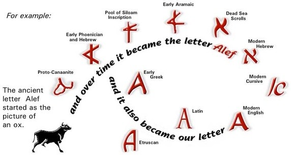 |
| Fig. 1. The development of the Greek alphabet. |
Previously, type was only designed for specific purposes such as for use in social, cultural and political contexts. However, in 1870, William Foster changed the development and distribution of type when he produced the Elementary Education Act which allowed children to learn the ability to read, rather than it being exclusively for the privileged few.
"Since typography is a communication method that utilises a gathering of related subjects and methodologies that includes sociology, linguistics, psychology, aesthetics and so much more, there is no single approach within typography that applies to everything" - Shelley Gruendler.
Tuesday, 25 October 2016
OUGD401 - Study Task 01 - Finding Research Sources
COP Theme: SOCIETY
Key Terms: Gender, body image, gender and advertising, gender and the media, gender representation, gender and branding, consumer society.
Finding a variety of research sources when undertaking a project is crucial to understanding the history behind the theme of your work, as well as making your work more informative and to help make informative design decisions or analysis. Sources can come from written texts in the form of books, journals and magazine articles, and online resources such as websites, blog posts and e-books. Information could also be gathered from research visits, such as to museums and galleries.
Our task was to find relevant research sources for our chosen theme/quote, and to facilitate our methods of gathering these sources, which focus on speed, accuracy and reliability, as well as the physical content of the resources.
LCA Library:
1. Consumer Psychology (2010) - Catherine Jansson-Boyd.
"Many studies have found that both women and men do not believe that their current body form is attractive... Research has repeatedly found that physically attractive individuals are perceived by most to be socially more desirable than those that are perceived as being unattractive, something that is likely to have been reinforced by consumer societies".
Dr Catherine Jansson-Boyd is a consumer psychologist and a Reader in psychology at Anglia Ruskin University, Cambridge, with a particular interest in how consumers evaluate products and consumer environments based on aesthetics. She has published a number of books based on her two main categories of research, being consumer psychology and aesthetic research. Her vast amount of research means she has years worth of experience and knowledge into the subject of consumer psychology and society, therefore making her a trustworthy source of research. Although, many psychological studies can be unreliable due to confounding variables, which can reduce the validity of the research and so must also be taken into consideration when using such resources.
2. Media, Gender and Identity - An Introduction (2008) - David Gauntlett.
3. Gender and the Media (2006) - Rosalind Gill.
4. Media and Society: Critical Perspectives (2004) - Graeme Burton.
Google Books (preview):
1. Advertising Cultures: Gender, Commerce and Creativity (2008) - Sean Nixon.
2. Advertising and the Mind of the Consumer: What Works, What Doesn't and Why? (2008) - Max Sutherland.
3. Putting on Appearances: Gender and Advertising (1988) - Diane Barthel.
Google Scholar:
1. Controversies in Contemporary Advertising (2013), Chapter 7: Gender and Advertising - Kim Bartel Sheehan.
2. Women's Studies in Communication: The Gender of Branding (2008) - J. M. Grow.
3. Journal of Consumer Research: Why do Brands Cause Trouble: A Dialectical Theory of Consumer Culture and Branding (2002) - D. B. Holt.
Websites:
1. webdam.com/blog/the-psychology-behind-the-brands-we-love
"Identity may explain why many of the best-loved brands communicate personality traits that consumers identify with or wish to emulate, such as being young, tech-savvy, wealthy, or sexy. If your brand doesn't resonate with your customer's real or desired identity, it's unlikely your brand will inspire love".
This blog post focuses on three concepts from psychology which many explain the reasons we love certain brands: emotional decision making, identity and social identity. It makes reference to Apple's 2006 'Get a Mac' campaign which suggested that the brands we buy signify the type of person you are, which in turn helps to form our identities. Published in April 2015, the post is still fairly recent, which increases the reliability of the source. However, it is not certain that the information collected came themselves from reliable sources. For example, one of these sources being a news article could be questioned, as information in such articles occasionally get manipulated by editors and journalists to imply a slightly different message than originally intended.
2. interbrand.com/views/examining-gender-roles-in-the-context-of-brand/
3. teddykw2.files.wordpress.com/2012/07/advertising-cultures.pdf
Jstor:
1. Gender Representations in Advertising: No Time for Change (2000) - Lena Slachmuijlder.
2. Putting on Appearances: Gender and Advertising (1988) - Diane Barthel.
3. Gendered by Design: How Woman's Place in Design is Still Defined by Gender (1999) - Sue Clegg and Wendy Mayfield.
Tuesday, 18 October 2016
OUGD401 - Analysis of Quotes
Society:
Jansson-Boyd, C. (2010) - Consumer Psychology. New York: McGraw Hill Education.
"Many studies have found that both women and men do not believe that their current body form is attractive... Research has repeatedly found that physically attractive individuals are perceived by most to be socially more desirable than those that are perceived as being unattractive, something that is likely to have been reinforced by consumer societies".
Key words: Gender, body image, gender and advertising, gender and the media, gender representation, gender and branding, gender and consumer society.
This quote makes reference to those individuals who are perceived as being 'physically attractive', however this already poses a problem, as what we find attractive in an individual is subjective, a personal preference which is different for everyone. Therefore when portraying physical attractiveness of a person in design and the media this can be seen as a suggestion as to what the media believe constitutes as 'attractive' and is ultimately never going to be an accurate representation of body image. This is not only due to the subjectiveness of the topic, but also how this 'desired' body image is dictated by only a minority of organisations. By making reference to both men and women, this quote focuses on gender representation in branding and advertising, suggesting that men can also be accounted into this problem of false body image and expectations.
History:
Carr E. H. (1961) - What is History? Cambridge: Cambridge University Press.
"The history we read... though based on facts, is, strictly speaking, not factual at all, but a series of accepted judgements".
Key words: History and truth, representations of western history, graphic design history, visual communication and truth, modernism, postmodernism, conspiracy theories and the internet.
This quote focuses on trends and approaches towards graphic design throughout history. It questions the truth in the history of graphic design and advertising, claiming that nothing is fact, only judgements which have been accepted by society as fact. It looks at how truth is communicated through media forms and represented through graphic design, and ultimately how graphic design relates to history.
Culture:
Danesi, M. - Popular Culture: Introductory Perspectives. Lanham, USA: Rowman and Littlefield.
"Modern-day pop culture... is a mass culture, spread widely through the mass media and mass communications technologies. Pop culture would not have become so widespread without the partnership that it has always had with the mass media".
Key words: Popular culture, mass culture, mass media, mass communication, high brow vs. low brow, high culture vs. low culture.
Popular culture can be defined as "cultural activities or commercial products reflecting, suited to, or aimed at the tastes of the general masses of people" (dictionary.com/browse/pop--culture). This quote focuses on pop culture and it's connections with design, branding and advertising, specifically high brow vs. low brow design. It suggests how artistic value can be recognised, however many social problems are often overlooked; popular culture is extremely relevant to understanding today's society.
Technology:
Erik Spiekermann (2014) - Interview in Creative Characters.
"What I find very interesting is the movement of people who are savvy in digital design but are genuinely interested in analog techniques. It is now more than a passing trend; there must be a deeper motive why we are newly interested in the hand-made and the haptic, material and three-dimensional aspects of type and design".
Key words: Letterpress, print making, theory of craft, handmade graphic design, traditional print media, decorative typography.
This quote concerns the differences between contemporary digital design, and more traditional design and production techniques, such as handmade production and printing. It looks at the reemergence of handmade graphic design techniques and how this is taking design back towards it's roots, as well as considering the advantages and/or disadvantages of rapidly developing technology which is changing graphic design as a whole. What impact is this having on contemporary graphic design practice?
Aesthetics:
Vignelli, M. - Long Live Modernism: Massimo Vignelli Reaffirms His Faith in Form and Function. AIGA.
"I was raised to believe that, as a designer, I have the responsibility to improve the world around us, to make it a better place to live, to fight and oppose trivia, kitsch and all norms of subculture that are visually polluting our world".
Key words: Modernism, minimal design, functional graphic design, form follows function, kitsch.
Massimo Vignelli was an Italian designer, whose work sat firmly within the modernist tradition of design. As a very opinionated designer, he believed that we have a responsibility to improve the world by getting rid of any 'bad' graphic design. This quote also raises problems associated with subjectiveness. What Vignelli believed to be bad graphic design may be an example of good graphic design to another person. He believed that design must be timeless, however it is clear that design is not static, it is constantly developing with the times.
Politics:
Downer, L. (2015) - Political Branding Strategies: Campaigning and Governing in Australian Politics. Australia: Palgrave.
"More and more in Western democracies, branding is used by political practitioners as a strategy for campaigning and governing. Brands are crafted for parties, politicians and policies. Put simply, political branding sees parties and politicians borrowing concepts and techniques from the world of commerce".
Key words: Political branding, branding, advertising, propaganda, graphic design and elections, branding political parties.
This quote examines how design and media is used in propaganda and political branding. It concerns work such as Jackson Pollock's paintings which were being used as a weapon for the CIA, and raises questions such as, is it freedom of expression for the sake of art or expression for the sake of propaganda and weapon? It can be seen by some that these artworks lose their original meanings and then become images of revolution and political struggle, however it could be argued that this is essentially a part of their overall meaning, as graphic design continues to develop.
Wednesday, 12 October 2016
COP Lecture Series: The History of the Image
A 20,000 Year Non-Linear History of the Image:
Lascaux Caves, France:
Cave paintings from the Lascaux Caves in France have been preserved from 20,000 years ago. These paintings include images of cattle and various other animals, people, shapes and patterns, which are believed to be a way for people living in the Stone Age to record their days, much like a diary. Other theories suggest these paintings were attempts to communicate with a higher power, such as a God.
Images and symbols from these Lascaux cave paintings have since been retained in art and design today. An example of this is Cy Twombly's 2001 painting, Lepanto Panel 8 in his use of colour, shape and pattern. In this way it can be seen as a way of connecting the 21st Century to 20,000 years ago.
Another example of this can be seen through Richard Long's 1989 'Red Earth Circle' which was created using sand and mud. This piece of work enabled a continuity between aboriginal art and western contemporary art, much like the connections between Stone Age cave paintings and some 21st Century artworks.
However, this artwork raised the problem of cultural appropriation, defined as
Cultural appropriation can be seen as controversial, particularly in art, when elements of a minority culture are used by members of another majority culture outside of their original cultural context, therefore seeming to diminishing the culture of it's identity.
Spiritual and Emotional Responses to Art:
Some works of art require travel to go and view, such as the Rothko Chapel, Houston, Texas which opened in 1971. On the walls are fourteen works of art by Mark Rothko, all painted black but with subtle colour hues, which vary depending on the lighting on each particular day. This chapel soon after opening became a place for international cultures to exchange religious and philosophical beliefs, a place of prayer, with some viewers displaying very spiritual and emotional responses towards the paintings.
However, it is argued that it may not be the case of the paintings themselves causing these types of responses. Is it simply the way the institution has framed the artwork?
The paintings displayed in the Rothko Chapel are laid out in an octagonal shaped room, where the walls are slightly darker (an off-white shade) and where the lighting is subtly dimmer than the rest of the rooms in the gallery. Because of this it is argued by some that it is in fact the institutional framing of particular works of art in galleries that create these emotional responses. Are these responses brought on through a sense institutional authority, whereby we behave in a way we think we are expected to behave rather than produce our own natural responses to the artwork?
Take the Mona Lisa by Leonardo Da Vinci for instance. Millions travel to the Louvre in France to view this iconic painting. Is this painting simply meaningful because of it's essential characteristics as a painting or is it because of the queues of people waiting to see it that creates it's meaning?
The Mona Lisa is the only piece of artwork protected behind bullet-proof glass. Again, is it the gallery that creates this importance because of the way it has been presented? Does displaying the artwork behind bullet-proof glass give the painting it's meaning?
Viewing Artwork in the Digital Age:
In the world of mobile phones, cameras, video recorders and the internet, it is a lot easier now to view artwork, in particular for free. However, this poses the problem of stealing and recycling artwork already created.
For example, Marcel Duchamp's 1919 piece of work 'LHOOQ' is a reproduction of Da Vinci's Mona Lisa whereby he drew a moustache and beard over the painting and renamed the title, which if pronounced in French sounds like "she is hot in the arse" (elle a chaud au cul). Works like this are becoming increasingly more common in the world of the internet, but is this not degrading the authority of art, in particular it's institutional authority?
Another example is Banksy's 2013 Mona Lisa Mujahideen, which show how these works of art are becoming commodities - such graffiti walls being knocked down for the sake of being placed in galleries. Again, this diminishes the authority and meaning of such pieces where it almost becomes no longer graffiti, as it is no longer a piece of free art on the streets to be enjoyed by everyone.
Abstract Expressionism:
Jackson Pollock was an American painter typically seen as the pioneer of abstract expressionism in the 1940's. His paintings were produced through flicks of paint onto paper or canvas which were very gestural and strategically placed.
This art movement was then banned by social realists, claiming that it had no real value or meaning as a piece of art, and that it was a limitation on people and art. For example, Roy Lichtenstein's 1965 'Red Painting' was a response to Pollock's work, suggesting it as a cultural weapon due to funding Pollock was receiving from the CIA for the use of his art as propaganda.
This raises the question as to whether or not his artworks were freedom of expression or simply expression for the sake of his funding? Do such artworks then become images of revolution and political struggle? Meanings are lost and changed through this process of using art as a weapon.
Viewing Art in the Digital Age (2):
The use of art as a symbol for something or as propaganda is enhanced through the use of the internet in the 21st Century. For example, Jean Jullien's 2014 Peace for Paris illustration became an unofficial symbol of solidarity between people at the time of the Paris terror attacks. It shows how an automatic, spontaneous moment of expression can be reused through the internet until it eventually becomes known as a symbol for a major world event or crisis. The same can be said for photographs, paintings, etc.
This shows how throughout history, image making can be used to bring something to life or even seen to preserve it, and how the development of the internet has impacted the ways in which we now view art.
Lascaux Caves, France:
Cave paintings from the Lascaux Caves in France have been preserved from 20,000 years ago. These paintings include images of cattle and various other animals, people, shapes and patterns, which are believed to be a way for people living in the Stone Age to record their days, much like a diary. Other theories suggest these paintings were attempts to communicate with a higher power, such as a God.
Images and symbols from these Lascaux cave paintings have since been retained in art and design today. An example of this is Cy Twombly's 2001 painting, Lepanto Panel 8 in his use of colour, shape and pattern. In this way it can be seen as a way of connecting the 21st Century to 20,000 years ago.
Another example of this can be seen through Richard Long's 1989 'Red Earth Circle' which was created using sand and mud. This piece of work enabled a continuity between aboriginal art and western contemporary art, much like the connections between Stone Age cave paintings and some 21st Century artworks.
However, this artwork raised the problem of cultural appropriation, defined as
- 'the adoption or use of elements of one culture by members of another culture'.
Cultural appropriation can be seen as controversial, particularly in art, when elements of a minority culture are used by members of another majority culture outside of their original cultural context, therefore seeming to diminishing the culture of it's identity.
Spiritual and Emotional Responses to Art:
Some works of art require travel to go and view, such as the Rothko Chapel, Houston, Texas which opened in 1971. On the walls are fourteen works of art by Mark Rothko, all painted black but with subtle colour hues, which vary depending on the lighting on each particular day. This chapel soon after opening became a place for international cultures to exchange religious and philosophical beliefs, a place of prayer, with some viewers displaying very spiritual and emotional responses towards the paintings.
However, it is argued that it may not be the case of the paintings themselves causing these types of responses. Is it simply the way the institution has framed the artwork?
The paintings displayed in the Rothko Chapel are laid out in an octagonal shaped room, where the walls are slightly darker (an off-white shade) and where the lighting is subtly dimmer than the rest of the rooms in the gallery. Because of this it is argued by some that it is in fact the institutional framing of particular works of art in galleries that create these emotional responses. Are these responses brought on through a sense institutional authority, whereby we behave in a way we think we are expected to behave rather than produce our own natural responses to the artwork?
Take the Mona Lisa by Leonardo Da Vinci for instance. Millions travel to the Louvre in France to view this iconic painting. Is this painting simply meaningful because of it's essential characteristics as a painting or is it because of the queues of people waiting to see it that creates it's meaning?
The Mona Lisa is the only piece of artwork protected behind bullet-proof glass. Again, is it the gallery that creates this importance because of the way it has been presented? Does displaying the artwork behind bullet-proof glass give the painting it's meaning?
Viewing Artwork in the Digital Age:
In the world of mobile phones, cameras, video recorders and the internet, it is a lot easier now to view artwork, in particular for free. However, this poses the problem of stealing and recycling artwork already created.
For example, Marcel Duchamp's 1919 piece of work 'LHOOQ' is a reproduction of Da Vinci's Mona Lisa whereby he drew a moustache and beard over the painting and renamed the title, which if pronounced in French sounds like "she is hot in the arse" (elle a chaud au cul). Works like this are becoming increasingly more common in the world of the internet, but is this not degrading the authority of art, in particular it's institutional authority?
Another example is Banksy's 2013 Mona Lisa Mujahideen, which show how these works of art are becoming commodities - such graffiti walls being knocked down for the sake of being placed in galleries. Again, this diminishes the authority and meaning of such pieces where it almost becomes no longer graffiti, as it is no longer a piece of free art on the streets to be enjoyed by everyone.
Abstract Expressionism:
Jackson Pollock was an American painter typically seen as the pioneer of abstract expressionism in the 1940's. His paintings were produced through flicks of paint onto paper or canvas which were very gestural and strategically placed.
This art movement was then banned by social realists, claiming that it had no real value or meaning as a piece of art, and that it was a limitation on people and art. For example, Roy Lichtenstein's 1965 'Red Painting' was a response to Pollock's work, suggesting it as a cultural weapon due to funding Pollock was receiving from the CIA for the use of his art as propaganda.
This raises the question as to whether or not his artworks were freedom of expression or simply expression for the sake of his funding? Do such artworks then become images of revolution and political struggle? Meanings are lost and changed through this process of using art as a weapon.
Viewing Art in the Digital Age (2):
The use of art as a symbol for something or as propaganda is enhanced through the use of the internet in the 21st Century. For example, Jean Jullien's 2014 Peace for Paris illustration became an unofficial symbol of solidarity between people at the time of the Paris terror attacks. It shows how an automatic, spontaneous moment of expression can be reused through the internet until it eventually becomes known as a symbol for a major world event or crisis. The same can be said for photographs, paintings, etc.
This shows how throughout history, image making can be used to bring something to life or even seen to preserve it, and how the development of the internet has impacted the ways in which we now view art.
COP Lecture Series: Visual Literacy - The Language of Design
Visual Literacy - The Language of Design:
The premis of this lecture was to understand the meanings of visual communication and visual literacy, and how these are used in design.

Aimed at answering the question - why is this not just an apple?
As a young graphic designer, it is a part of my job to communicate - we need to be able to communicate ideas and concepts effectively to various audiences in a range of different concepts. So visual communication and visual literacy are important aspects of this.
(1). Visual communication is defined as 'the process of sending and receiving messages using type and image'.
This is based on a shared understanding of signs, symbols, gestures as well as objects, which can be affected by audience, context, media and method of distribution.
(2). Visual literacy is defined as 'the ability to construct meaning from visual type and image', created through interpreting images of the past, present and other cultures to produce images that effectively communicate a message to an audience.
Principle one:
 This can be used as a global system for communication as a result of social and cultural conditioning. For instance, a toilet sign can be correctly read even if it is in another language purely based on universal signs, symbols and representation. This includes certain colours, forms and the context in which the signs are in which we have learnt through social and cultural conditioning when growing up, therefore creating a universal language to enable designers to work creatively.
Principle two:
 Visual syntax refers to the pictorial structure and visual organisation of elements, which represents the basic building blocks of an image that can affect the way in which we read it. These elements include, framing, format, colour, weight, composition, manipulation, etc. (principle six).

Visual synecdoche:
This term is applied when a part of something is used to represent the whole or visa versa.
The main subject is substituted for something that is inherently connected to it, however this only works if what the synecdoche represents is universally recognised. In this case, it would be the Statue of Liberty.
Visual metonym:
A symbolic image that is used to make reference to something with a more literal meaning. For example, a yellow taxi or cab. Through association, the viewer makes a connection between the image and intended subject, however unlike a visual synecdoche, the two images show a close relationship but are not intrinsically linked.

Visual metaphor:
This is used to transfer the meaning of one image to another. These images may have no close relationship but conveys an impression about something unfamiliar comparing it with something that is familiar, for example, the big apple.
Such associations with the word 'apple' include those along the lines of health and well-being which were used in a New York ad campaign to attract people to the American city claiming that it is good for their mental and physical well-being, a fresh new city, hence being known as 'The Big Apple'.
Principle nine:

The premis of this lecture was to understand the meanings of visual communication and visual literacy, and how these are used in design.

Aimed at answering the question - why is this not just an apple?
As a young graphic designer, it is a part of my job to communicate - we need to be able to communicate ideas and concepts effectively to various audiences in a range of different concepts. So visual communication and visual literacy are important aspects of this.
(1). Visual communication is defined as 'the process of sending and receiving messages using type and image'.
This is based on a shared understanding of signs, symbols, gestures as well as objects, which can be affected by audience, context, media and method of distribution.
(2). Visual literacy is defined as 'the ability to construct meaning from visual type and image', created through interpreting images of the past, present and other cultures to produce images that effectively communicate a message to an audience.
Principle one:
- Visual literacy is the ability to interpret, negotiate and make meaning from information that is presented in the form of an image.
 This can be used as a global system for communication as a result of social and cultural conditioning. For instance, a toilet sign can be correctly read even if it is in another language purely based on universal signs, symbols and representation. This includes certain colours, forms and the context in which the signs are in which we have learnt through social and cultural conditioning when growing up, therefore creating a universal language to enable designers to work creatively.
Principle two:
- Visual literacy is based on the idea that pictures can be read.
For example, instructional pictures using sign, symbol and representation to create this universal language for communication.
Principle three:
- Visual communication is made up of symbols whose meaning results from their existence in particular contexts. The conventions of visual communication is a combination of universal and cultural symbols.
Other examples include changing the colour and form of the symbols. A green cross would now represent first aid and a red cross would represent the Red Cross Charity. However, we stretch the form of the cross using these colours and they become flags of countries such as England and Denmark.
Visual literacy is not static, it continues to develop!
Principle four:
- The basic premise of visual literacy is that for any language to exist, an agreement must be created amongst a group of people that one thing will stand for another.
This then leads on to the idea of visual semantics and principle five, being:
- Being visually literate requires an awareness of the relationship between what is called visual syntax and visual semantics.
 Visual syntax refers to the pictorial structure and visual organisation of elements, which represents the basic building blocks of an image that can affect the way in which we read it. These elements include, framing, format, colour, weight, composition, manipulation, etc. (principle six).
For example, an egg could represent various things such as Easter, new life, growth, food, etc but frame it in a different way by adding an egg-cup and we now recognise it specifically as a boiled egg.
We create these representations through emotional and physiological responses, and this shows how presentation and layout are important aspects of design.
We create these representations through emotional and physiological responses, and this shows how presentation and layout are important aspects of design.
Visual semantics refers to the way an image fits into a cultural process of communication. This includes the relationship between meaning and form, and the way meaning is created. Elements of visual semantics includes, cultural references, social ideas, religious beliefs, recognised symbols, etc. (principle seven).
Principle eight:
- Semiotics is the study of signs and sign processes, also known as semiosis. Indication, analogy, metaphor, symbolism, signification and communication are also parts of this.
Semiotics is closely related to the field of linguistics which studies the structure and meaning of language, and also studies non-linguistic sign systems, visual language and visual literacy. Elements of this include, symbol, sign, signifier, metaphor, metonym and synecdoche.
For example, Apple (brand).
It's symbol would be the logo - it symbolises an apple,
the sign would also be it's identity, as it is a sign for apple products,
and it's signifier would be the brand itself, as it signifies innovation, creativity, design and lifestyle.
Other associations when put into context: So why is this more than just an apple?

Visual synecdoche:
This term is applied when a part of something is used to represent the whole or visa versa.
The main subject is substituted for something that is inherently connected to it, however this only works if what the synecdoche represents is universally recognised. In this case, it would be the Statue of Liberty.
Visual metonym:
A symbolic image that is used to make reference to something with a more literal meaning. For example, a yellow taxi or cab. Through association, the viewer makes a connection between the image and intended subject, however unlike a visual synecdoche, the two images show a close relationship but are not intrinsically linked.

Visual metaphor:
This is used to transfer the meaning of one image to another. These images may have no close relationship but conveys an impression about something unfamiliar comparing it with something that is familiar, for example, the big apple.
Such associations with the word 'apple' include those along the lines of health and well-being which were used in a New York ad campaign to attract people to the American city claiming that it is good for their mental and physical well-being, a fresh new city, hence being known as 'The Big Apple'.
Principle nine:
- "Work the metaphor. Every object has the capacity to stand for something other than what is apparent. Work on what it stands for" - Incomplete Manifesto for Growth, Bruce Mau.

So why is this not just an apple? It is a picture of an apple.
Subscribe to:
Posts (Atom)